Home
Welcome to the fltk-rs book!
This is an introductory book targeting the fltk crate. Other resources include:
- Official Documentation
- Videos
- Discussions
- Examples
- Demos
- 7guis-fltk-rs
- FLTK-RS-Examples
- Erco's FLTK cheat page, which is an excellent FLTK C++ reference.
FLTK is a cross-platform lightweight gui library. The library itself is written in C++98, which is highly-portable. The fltk crate is written in Rust, and uses FFI to call into the FLTK wrapper, cfltk, which is written in C89 and C++11.
The library has a minimalist architecture, and would be familiar to developers used to Object-Oriented gui libraries. The wrapper itself follows the same model which simplifies the documentation, since method names are identical or similar to their C++ equivalents. This makes referring the FLTK C++ documentation quite simpler since the methods basically map to each other.
#include <FL/Fl_Window.H>

int main() {
    auto wind = new Fl_Window(100, 100, 400, 300, "My Window");
    wind->end();
    wind->show();
}
maps to:
use fltk::{prelude::*, window};

fn main() {
    let mut wind = window::Window::new(100, 100, 400, 300, "My Window");
    wind.end();
    wind.show();
}
Why choose FLTK?
- Lightweight. Small binary, around 1mb after stripping. Small memory footprint.
- Speed. Fast to install, fast to build, fast at startup and fast at runtime.
- Single executable. No DLLs to deploy.
- Supports old architectures.
- FLTK's permissive license which allows static linking for closed-source applications.
- Themeability (4 supported schemes: Base, GTK, Plastic, Gleam and Oxy), and additional theming using fltk-theme.
- Provides around 80 customizable widgets.
- Has inbuilt image support.
Usage
Just add the following to your project's Cargo.toml file:
[dependencies]
fltk = "^1.5"
To use the bundled libs (available for x64 windows (msvc & gnu (msys2)), x64 linux & macos):
[dependencies]
fltk = { version = "^1.5", features = ["fltk-bundled"] }
The library is automatically built and statically linked to your binary.
To make our first Rust code sample work, we need to import the necessary fltk modules:
use fltk::{prelude::*, window::Window};

fn main() {
    let mut wind = Window::new(100, 100, 400, 300, "My Window");
    wind.end();
    wind.show();
}
If you run the code sample, you might notice it does nothing. We actually need to run the event loop, this is equivalent to using Fl::run() in C++:
use fltk::{app, prelude::*, window::Window};

fn main() {
    let a = app::App::default();
    let mut wind = Window::new(100, 100, 400, 300, "My Window");
    wind.end();
    wind.show();
    a.run().unwrap();
}
We instantiate the App struct, which initializes the runtime and styles, then at the end of main, we call the run() method.
Contributing to the book
The book is generated using mdbook on the fltk-book repo.
As such, you would need to cargo install mdbook. More instructions can be found in fltk-book's README and in mdbook's user guide.
You can also contribute to the Chinese translation here
Setup
Build Dependencies
Rust (version > 1.55), CMake (version > 3.11), Git and a C++11 compiler need to be installed and in your PATH for a crossplatform build from source. This crate also offers a bundled form of fltk on selected platforms, this can be enabled using the fltk-bundled feature flag (which requires curl and tar to download and unpack the bundled libraries). If you have ninja-build installed, you can enable it using the "use-ninja" feature. This should accelerate build times significantly.
- Windows:
- MSVC: Windows SDK
- Gnu: No dependencies
- MacOS: No dependencies.
- Linux: X11 and OpenGL development headers need to be installed for development. The libraries themselves are available on linux distros with a graphical user interface.
For Debian-based GUI distributions, that means running:
sudo apt-get install libx11-dev libxext-dev libxft-dev libxinerama-dev libxcursor-dev libxrender-dev libxfixes-dev libpango1.0-dev libgl1-mesa-dev libglu1-mesa-dev
For RHEL-based GUI distributions, that means running:
sudo yum groupinstall "X Software Development" && yum install pango-devel libXinerama-devel libstdc++-static
For Arch-based GUI distributions, that means running:
sudo pacman -S libx11 libxext libxft libxinerama libxcursor libxrender libxfixes pango cairo libgl mesa --needed
For Alpine linux:
apk add pango-dev fontconfig-dev libxinerama-dev libxfixes-dev libxcursor-dev
- Android: Android Studio, Android Sdk, Android Ndk.
Runtime Dependencies
- Windows: None
- MacOS: None
- Linux: You need X11 libraries, as well as pango and cairo for drawing (and OpenGL if you want to enable the enable-glwindow feature):
apt-get install -qq --no-install-recommends libx11-6 libxinerama1 libxft2 libxext6 libxcursor1 libxrender1 libxfixes3 libcairo2 libpango-1.0-0 libpangocairo-1.0-0 libpangoxft-1.0-0 libglib2.0-0 libfontconfig1 libglu1-mesa libgl1
Note that if you installed the build dependencies, it will also install the runtime dependencies automatically as well.
Also note that most graphical desktop environments already have these libs already installed. This list can be useful if you are testing your already built package in CI/docker (where there is not graphical user interface).
Detailed setup
This section assumes you don't even have Rust installed, and is separated into different environments:
Windows (MSVC toolchain)
- Go to the rust-lang get-started section.
- Follow the link to
Visual Studio C++ Build toolsand download the MSVC compiler and Windows sdk. - Using the installer, install:

and make sure the following are checked:

- You can also check CMake in the previous list, or download CMake from here.
- If you don't have
git, make sure to get it from here. - From the rust-lang.org website, download the correct rustup installer for your architecture.
- Once you're all set up, you can create a Rust project using
cargo new, addfltkas a dependency in your Cargo.toml and build your application.
Windows (gnu toolchain)
If you don't already have msys2, you can get it from here.
- You can get the Rust toolchain via the pacman package manager, or via rustup as described previously. The installation process however would require specifying the use of the gnu toolchain (not choosing the default which would install the MSVC toolchain). The toolchain should also reflect the architecture of your machine. For example, a 64bit machine should install the x86_64-pc-windows-gnu toolchain. If you decide to get Rust via the package manager, make sure you're getting the mingw variant, and with the correct MINGW_PACKAGE_PREFIX (for 64bits, that env variable would equate to mingw-w64-x86_64).
- Assuming you're installing everything via pacman, open the mingw shell (not the msys2 shell, it can be found bundled in the msys2 install directory, or via
source shell mingw64) and run the following:
pacman -S curl tar git $MINGW_PACKAGE_PREFIX-rust $MINGW_PACKAGE_PREFIX-gcc $MINGW_PACKAGE_PREFIX-cmake $MINGW_PACKAGE_PREFIX-make --needed
You can replace $MINGW_PACKAGE_PREFIX-make with $MINGW_PACKAGE_PREFIX-ninja if you plan to use ninja via the use-ninja feature.
- Once you're all set up, you can create a Rust project using
cargo new, addfltkas a dependency in your Cargo.toml and build your application.
MacOS
- To get the Xcode Command Line Tools (which have the C++ compiler), run:
xcode-select --install
Follow the instructions. Alternatively you can install clang or gcc from homebrew.
- To get CMake, you can get it from here.
Or from homebrew as well.
brew install cmake
- To get the Rust toolchain:
curl --proto '=https' --tlsv1.2 -sSf https://sh.rustup.rs | sh
And follow the default instructions.
- Once you're all set up, you can create a Rust project using
cargo new, addfltkas a dependency in your Cargo.toml and build your application.
Linux
- Use your package manager to get a C++ compiler, CMake, make, git. Taking Debian/Ubuntu as an example:
sudo apt-get install g++ cmake git make
- To get the dev dependencies for FLTK, you can also use your package manager: For Debian-based GUI distributions, that means running:
sudo apt-get install libx11-dev libxext-dev libxft-dev libxinerama-dev libxcursor-dev libxrender-dev libxfixes-dev libpango1.0-dev libgl1-mesa-dev libglu1-mesa-dev
For RHEL-based GUI distributions, that means running:
sudo yum groupinstall "X Software Development" && yum install pango-devel libXinerama-devel libstdc++-static
For Arch-based GUI distributions, that means running:
sudo pacman -S libx11 libxext libxft libxinerama libxcursor libxrender libxfixes pango cairo libgl mesa --needed
For Alpine linux:
apk add pango-dev fontconfig-dev libxinerama-dev libxfixes-dev libxcursor-dev
- To get the Rust toolchain:
curl --proto '=https' --tlsv1.2 -sSf https://sh.rustup.rs | sh
And follow the default instructions.
- Once you're all set up, you can create a Rust project using
cargo new, addfltkas a dependency in your Cargo.toml and build your application.
Cross-compiling
Using a prebuilt bundle
If the target you're compiling to, already has a prebuilt package:
- x86_64-pc-windows-gnu
- x86_64-pc-windows-msvc
- x86_64-apple-darwin
- aarch64-apple-darwin
- x86_64-unknown-linux-gnu
- aarch64-unknown-linux-gnu
Add the target via rustup, then invoke the build:
rustup target add <your target> # replace with one of the targets above
cargo build --target=<your target> --features=fltk-bundled
For aarch64-unknonw-linux-gnu, you might have to specify the linker:
CARGO_TARGET_AARCH64_UNKNOWN_LINUX_GNU_LINKER=aarch64-linux-gnu-gcc cargo build --target=aarch64-unknown-linux-gnu --features=fltk-bundled
You can specify the linker in a .cargo/config.toml file so you won't have to pass it to the build command:
# .cargo/config.toml
[target.aarch64-unknown-linux-gnu]
linker = "aarch64-linux-gnu-gcc"
Then:
cargo build --target=aarch64-unknown-linux-gnu --features=fltk-bundled
Using cross
If you have Docker installed, you can try cross.
cargo install cross
cross build --target=x86_64-pc-windows-gnu # replace with your target, the Docker daemon has to be running, no need to add via rustup
If your target requires external dependencies, like on Linux, you would have to create a custom docker image and use it for your cross-compilation via either:
1- a Cross.toml file + Dockerfile:
For example, for a project of the following structure:
myapp
     |_src
     |    |_main.rs
     |
     |_Cargo.toml
     |
     |_Cross.toml
     |
     |_arm64-dockerfile
The arm64-dockerfile (the name doesn't matter, just make sure Cross.toml points to the file) contents:
FROM ghcr.io/cross-rs/aarch64-unknown-linux-gnu:edge

ENV DEBIAN_FRONTEND=noninteractive

RUN dpkg --add-architecture arm64 && \
    apt-get update && \
    apt-get install --assume-yes --no-install-recommends \
    libx11-dev:arm64 libxext-dev:arm64 libxft-dev:arm64 \
    libxinerama-dev:arm64 libxcursor-dev:arm64 \
    libxrender-dev:arm64  libxfixes-dev:arm64  libgl1-mesa-dev:arm64 \
    libglu1-mesa-dev:arm64 libasound2-dev:arm64 libpango1.0-dev:arm64
Notice the architecture appended to the library package's name like: libx11-dev:arm64.
The Cross.toml contents:
[target.aarch64-unknown-linux-gnu]
dockerfile = "./arm64-dockerfile"
2- Configuring Cargo.toml:
[package.metadata.cross.target.aarch64-unknown-linux-gnu]
pre-build = [""" \
    dpkg --add-architecture arm64 && \
    apt-get update && \
    apt-get install --assume-yes --no-install-recommends \
    libx11-dev:arm64 libxext-dev:arm64 libxft-dev:arm64 \
    libxinerama-dev:arm64 libxcursor-dev:arm64 \
    libxrender-dev:arm64  libxfixes-dev:arm64  libgl1-mesa-dev:arm64 \
    libglu1-mesa-dev:arm64 libasound2-dev:arm64 libpango1.0-dev:arm64 \
    """]
Then run cross:
cross build --target=aarch64-unknown-linux-gnu
(This might take a while for the first time)
Using a cross-compiling C/C++ toolchain
The idea is that you need a C/C++ cross-compiler and a Rust target installed via rustup target add as mentioned in the previous scenario.
For Windows and MacOS, the system compiler would already support targetting the supported architectures. For example, on MacOS, if you can already build fltk apps using your system compiler, you can target a different architecture using (assuming you have an intel x86_64 mac):
rustup target add aarch64-apple-darwin
cargo build --target=arch64-apple-darwin
Linux to 64-bit Windows
Assuming you would like to cross-compile from Linux to 64-bit Windows, and are already able to build on your host machine:
- You'll need to add the Rust target using:
rustup target add x86_64-pc-windows-gnu # depending on the arch
- Install a C/C++ cross-compiler like the Mingw toolchain. On Debian-based distros, you can run:
apt-get install mingw-w64 # or gcc-mingw-w64-x86-64
On RHEL-based distros:
dnf install mingw64-gcc
On Arch:
pacman -S mingw-w64-gcc
On Alpine:
apk add mingw-w64-gcc
- Add a
.cargo/config.tomlin your project root (or HOME dir if you want the setting to be global), and specify the cross-linker and the archiver:
# .cargo/config.toml
[target.x86_64-pc-windows-gnu]
linker = "x86_64-w64-mingw32-gcc"
ar = "x86_64-w64-mingw32-gcc-ar"
- Run the build:
cargo build --target=x86_64-pc-windows-gnu
x64 linux-gnu to aarch64 linux-gnu
Another example is building from x86_64 debian-based distro to arm64 debian-based distro: Assuming you already have cmake already installed.
- You'll need to add the Rust target using:
rustup target add aarch64-unknown-linux-gnu
- Install a C/C++ cross-compiler like the Mingw toolchain. On Debian-based distros, you can run:
apt-get install g++-aarch64-linux-gnu
- Add the required architecture to your system:
sudo dpkg --add-architecture arm64
- You might need to add the following mirrors to /etc/apt/sources.list:
sudo sed -i "s/deb http/deb [arch=amd64] http/" /etc/apt/sources.list
echo "deb [arch=arm64] http://ports.ubuntu.com/ $(lsb_release -c -s) main multiverse universe" | sudo tee -a /etc/apt/sources.list
echo "deb [arch=arm64] http://ports.ubuntu.com/ $(lsb_release -c -s)-security main multiverse universe" | sudo tee -a /etc/apt/sources.list
echo "deb [arch=arm64] http://ports.ubuntu.com/ $(lsb_release -c -s)-backports main multiverse universe" | sudo tee -a /etc/apt/sources.list
echo "deb [arch=arm64] http://ports.ubuntu.com/ $(lsb_release -c -s)-updates main multiverse universe" | sudo tee -a /etc/apt/sources.list
The first command changes the current mirrors to reflect your current amd64 system. The others add the arm64 ports to your /etc/apt/sources.list file.
- Update your package manager's database:
sudo apt-get update
- Install the required dependencies for your target architecture:
sudo apt-get install libx11-dev:arm64 libxext-dev:arm64 libxft-dev:arm64 libxinerama-dev:arm64 libxcursor-dev:arm64 libxrender-dev:arm64 libxfixes-dev:arm64 libpango1.0-dev:arm64 libgl1-mesa-dev:arm64 libglu1-mesa-dev:arm64 libasound2-dev:arm64
Notice the :arm64 suffix in the packages' name.
- Run the build:
CC=aarch64-linux-gnu-gcc CXX=aarch64-linux-gnu-g++ CARGO_TARGET_AARCH64_UNKNOWN_LINUX_GNU_LINKER=aarch64-linux-gnu-gcc cargo build --target=aarch64-unknown-linux-gnu
You can specify the linker in a .cargo/config.toml file so you won't have to pass it to the build command:
# .cargo/config.toml
[target.aarch64-unknown-linux-gnu]
linker = "aarch64-linux-gnu-gcc"
Then:
cargo build --target=aarch64-unknown-linux-gnu
Using docker
Using a docker image of the target platform directly can save you from the hassle of cross-compiling to a different linux target using cross. You'll need a Dockerfile which pulls the target you want and install the Rust and C++ toolchains and the required dependencies. For example, building for alpine linux:
FROM alpine:latest AS alpine_build
RUN apk add rust cargo git cmake make g++ pango-dev fontconfig-dev libxinerama-dev libxfixes-dev libxcursor-dev
COPY . .
RUN cargo build --release

FROM scratch AS export-stage
COPY --from=alpine_build target/release/<your binary name> .
And run using:
DOCKER_BUILDKIT=1 docker build --file Dockerfile --output out .
Your binary will be in the ./out directory.
Note on alpine, if you install Rust via rustup, you might have to point the musl-gcc and musl-g++ to the appropriate toolchain in your dockerfile (before running cargo build):
RUN ln -s /usr/bin/x86_64-alpine-linux-musl-gcc /usr/bin/musl-gcc
RUN ln -s /usr/bin/x86_64-alpine-linux-musl-g++ /usr/bin/musl-g++
You would also need to add "-C target-feature=-crt-static" to RUSTFLAGS due to this rust toolchain issue: https://github.com/rust-lang/rust/issues/61328
i.e.
FROM alpine:latest AS alpine_build
ENV RUSTUP_HOME="/usr/local/rustup" CARGO_HOME="/usr/local/cargo" PATH="/usr/local/cargo/bin:$PATH" RUSTFLAGS="-C target-feature=-crt-static"
RUN apk add git curl cmake make g++ pango-dev fontconfig-dev libxinerama-dev libxfixes-dev libxcursor-dev

RUN ln -s /usr/bin/x86_64-alpine-linux-musl-gcc /usr/bin/musl-gcc
RUN ln -s /usr/bin/x86_64-alpine-linux-musl-g++ /usr/bin/musl-g++

RUN curl --proto '=https' --tlsv1.2 -sSf https://sh.rustup.rs | sh -s -- -y --profile minimal --default-toolchain stable-x86_64-unknown-linux-musl

COPY . .
RUN cargo build --release

FROM scratch AS export-stage
COPY --from=alpine_build target/release/<your binary name> .
Another example to compile from amd64 linux-gnu to arm64 linux-gnu:
FROM ubuntu:bionic AS ubuntu_build

ENV DEBIAN_FRONTEND=noninteractive

RUN apt-get update -qq
RUN	apt-get install -y --no-install-recommends lsb-release g++-aarch64-linux-gnu g++ cmake curl tar git make
RUN apt-get install -y ca-certificates && update-ca-certificates --fresh && export SSL_CERT_DIR=/etc/ssl/certs
RUN	dpkg --add-architecture arm64
RUN sed -i "s/deb http/deb [arch=amd64] http/" /etc/apt/sources.list
RUN echo "deb [arch=arm64] http://ports.ubuntu.com/ $(lsb_release -c -s) main multiverse universe" | tee -a /etc/apt/sources.list
RUN echo "deb [arch=arm64] http://ports.ubuntu.com/ $(lsb_release -c -s)-security main multiverse universe" | tee -a /etc/apt/sources.list
RUN echo "deb [arch=arm64] http://ports.ubuntu.com/ $(lsb_release -c -s)-backports main multiverse universe" | tee -a /etc/apt/sources.list
RUN echo "deb [arch=arm64] http://ports.ubuntu.com/ $(lsb_release -c -s)-updates main multiverse universe" | tee -a /etc/apt/sources.list
RUN	apt-get update -qq && apt-get install -y --no-install-recommends -o APT::Immediate-Configure=0 libx11-dev:arm64 libxext-dev:arm64 libxft-dev:arm64 libxinerama-dev:arm64 libxcursor-dev:arm64 libxrender-dev:arm64 libxfixes-dev:arm64 libpango1.0-dev:arm64 libgl1-mesa-dev:arm64 libglu1-mesa-dev:arm64 libasound2-dev:arm64
RUN curl https://sh.rustup.rs -sSf | sh -s -- --default-toolchain stable --profile minimal -y

ENV PATH="/root/.cargo/bin:$PATH" \
	CC=aarch64-linux-gnu-gcc CXX=aarch64-linux-gnu-g++ \
	CARGO_TARGET_AARCH64_UNKNOWN_LINUX_GNU_LINKER=aarch64-linux-gnu-gcc \
    CC_aarch64_unknown_linux_gnu=aarch64-linux-gnu-gcc \
    CXX_aarch64_unknown_linux_gnu=aarch64-linux-gnu-g++ \
    PKG_CONFIG_PATH="/usr/lib/aarch64-linux-gnu/pkgconfig/:${PKG_CONFIG_PATH}"

RUN rustup target add aarch64-unknown-linux-gnu

COPY . .

RUN  cargo build --release --target=aarch64-unknown-linux-gnu

FROM scratch AS export-stage
COPY --from=ubuntu_build target/aarch64-unknown-linux-gnu/release/<your binary name> .
Using a CMake toolchain file
The path to the file can be passed to CFLTK_TOOLCHAIN env variable:
CFLTK_TOOLCHAIN=$(pwd)/toolchain.cmake cargo build --target=<target architecture>
In newer versions of CMake (above 3.20), you can directly set the CMAKE_TOOLCHAIN_FILE environment variable.
The contents of the CMake toolchain file usually set the CMAKE_SYSTEM_NAME as well as the cross-compilers. Another thing which needs to be set on Linux/BSD is the PKG_CONFIG_EXECUTABLE and PKG_CONFIG_PATH. A sample toolchain file:
set(CMAKE_SYSTEM_NAME Linux)
set(CMAKE_SYSTEM_PROCESSOR aarch64)

set(triplet aarch64-linux-gnu)
set(CMAKE_C_COMPILER /usr/bin/${triplet}-gcc)
set(CMAKE_CXX_COMPILER /usr/bin/${triplet}-g++)
set(ENV{PKG_CONFIG_EXECUTABLE} /usr/bin/${triplet}-pkg-config)
set(ENV{PKG_CONFIG_PATH} "$ENV{PKG_CONFIG_PATH}:/usr/lib/${triplet}/pkgconfig")

set(CMAKE_FIND_ROOT_PATH_MODE_PROGRAM NEVER)
set(CMAKE_FIND_ROOT_PATH_MODE_LIBRARY ONLY)
set(CMAKE_FIND_ROOT_PATH_MODE_INCLUDE ONLY)
set(CMAKE_FIND_ROOT_PATH_MODE_PACKAGE ONLY)
Note the CMAKE_SYSTEM_PROCESSOR is usually the value of uname -m on the target platform, other possible values can be found here. We set the triplet variable in this example to aarch64-linux-gnu, which is the prefix used for the gcc/g++ compilers, as well as the cross-compiling aware pkg-config. This triplet is also equivalent to the Rust triplet aarch64-unknown-linux-gnu. The PKG_CONFIG_PATH is set to the directories containing the .pc files for our target, since these are required for the cairo and pango dependencies on Linux/BSD.
The last 4 options just tell CMake to not mix the include/library paths of both host/target.
Another toolchain file targetting windows (using the mingw toolchain):
set(CMAKE_SYSTEM_NAME Windows)
set(CMAKE_SYSTEM_PROCESSOR AMD64)

set(triplet x86_64-w64-mingw32)
set(CMAKE_C_COMPILER /usr/bin/${triplet}-gcc)
set(CMAKE_CXX_COMPILER /usr/bin/${triplet}-g++)

set(CMAKE_FIND_ROOT_PATH_MODE_PROGRAM NEVER)
set(CMAKE_FIND_ROOT_PATH_MODE_LIBRARY ONLY)
set(CMAKE_FIND_ROOT_PATH_MODE_INCLUDE ONLY)
set(CMAKE_FIND_ROOT_PATH_MODE_PACKAGE ONLY)
Using cargo xwin
If you need to target windows and the msvc compiler/abi, you can install cargo-xwin:
cargo install cargo-xwin
And build your project using:
cargo xwin build --release --target x86_64-pc-windows-msvc
Using the fltk-config feature:
FLTK provides a script called fltk-config which acts like pkg-config. It tracks the installed FLTK lib paths and the necessary cflags and ldflags. Since fltk-rs requires FLTK 1.4, and most distros don't provide it at the time of writing this, you would have to build FLTK from source for the target you require. However, once distros start distributing FLTK 1.4, it should as simple as (targetting arm64 gnu linux):
dpkg --add-architecture arm64
apt-get install libfltk1.4-dev:arm64

cargo build --target=aarch64-unknown-linux-gnu --features=fltk-config
If you need to build FLTK for a different architecture, you would need to use a CMake toolchain file (using the one from before):
git clone https://github.com/fltk/fltk --depth=1
cd fltk
cmake -B bin -G Ninja -DFLTK_BUILD_TEST=OFF -DCMAKE_BUILD_TYPE=Release -DCMAKE_TOOLCHAIN_FILE=/full/path/to/toolchain/file.cmake
cmake --build bin
cmake --instal bin # might need sudo in a hosted env
# then for your proj
cargo build --target=aarch64-unknown-linux-gnu --features=fltk-config
Fluid
FLTK offers a GUI WYSIWYG rapid application development tool called FLUID which allows creating GUI applications. Currently there is a video tutorial on youtube on using it with Rust: Use FLUID (RAD tool) with Rust
The fl2rust crate translates the Fluid generated .fl files into Rust code to be compiled into your app. For more information, you can check the project's repo.
You can get FLUID via fltk-fluid and fl2rust crates using cargo install:
cargo install fltk-fluid
cargo install fl2rust
And run using:
fluid &
Another option to get Fluid is to download it via your system's package manager, it comes as a separate package or part of the fltk package.
Currently, fl2rust, doesn't check the generated Rust code for correctness. It's also limited to constructor methods.
Usage
To start, you can create a new Rust project using cargo new app.
fl2rust is added as a build-dependency to your project:
# Cargo.toml
[dependencies]
fltk = "1"

[build-dependencies]
fl2rust = "0.4"
Then it can be used in the build.rs file (which is run pre-build) to generate Rust code:
// build.rs
fn main() {
    use std::path::PathBuf;
    use std::env;
    println!("cargo:rerun-if-changed=src/myuifile.fl");
    let g = fl2rust::Generator::default();
    let out_path = PathBuf::from(env::var("OUT_DIR").unwrap());
    g.in_out("src/myuifile.fl", out_path.join("myuifile.rs").to_str().unwrap()).expect("Failed to generate rust from fl file!");
}
We'll be naming our fluid file myuifile.fl. We tell cargo to rerun if that file is changed. We'll create the file in our source directory, but you can put it in its own directory if you wish. We tell the generator to take the fluid file and generate a myuifile.rs. This file is generated in the OUT_DIR, so you won't be seeing it in your src directory. However to include it, you need to create a Rust source file, it can be the same name as our outputted file, and put it in the src directory:
touch src/myuifile.rs
We'll have to import the contents from the auto-generated file using the include! macro:
#![allow(unused)]
fn main() {
// src/myuifile.rs
#![allow(unused_variables)]
#![allow(unused_mut)]
#![allow(unused_imports)]
#![allow(clippy::needless_update)]

include!(concat!(env!("OUT_DIR"), "/myuifile.rs"));
}
Then we'll be able to use the contents in main.rs:
// src/main.rs
use fltk::{prelude::*, *};
mod myuifile;

fn main() {
    let app = app::App::default();
    app.run().unwrap();
}
Now comes the gui part. Open fluid:
#![allow(unused)]
fn main() {
fltk-fluid & #or just fluid if installed from a package manager
}
The ampersand tells our shell to open it as a detached process, so we can still use our shell to compile our code.

We're greeted with an empty window along with a menu bar. Our first step here is to create a Class:

This will popup a dialog, we can leave the name as it is (UserInterface) by clicking Ok. Now you'll see our class listed:
 (We've expanded the window)
Next, press new again and we'll add a constructor function for our class:
 We'll also accept the default name which is
 make_window().
Next we'll add a window:

A new window pops up, we can enlarge it a bit by dragging the border:

Double clicking the window pops up a dialog where we can change the window's gui properties (under the GUI tab), style (under the Style tab) and class properties (under the C++ tab).

We'll give the window a label My Window in the Gui tab, we'll change the color to white in the Style tab:

And under the C++ tab, we'll give it the variable name my_win:

Our window will now be accessible via myuifile::UserInterface::my_win.
We'll add a button by left clicking the window and adding a Button:

This will open the same dialog as before but for the button. Under C++, we'll give it the variable name btn. Under style we'll change the color and label color. Then under Gui we'll give it the label "click me":

We'll drag the border to resize and drag the button to any position we want. Fluid has a layout menu where we can modify a number of widgets (if we had multiple buttons for example) to have the same layout/size ...etc:

We'll now save the file using File/Save As... as myuifile.fl in the src directory.
We can now run cargo run to check our build succeeds, but we still haven't call the make_window() method, so we won't see anything yet.
Now you can modify src/main.rs to show the window and add a callback to our button:
use fltk::{prelude::*, *};
mod myuifile;

fn main() {
    let app = app::App::default();
    let mut ui = myuifile::UserInterface::make_window();
    let mut win = ui.my_win.clone();
    ui.btn.set_callback(move |b| {
        b.set_label("clicked");
        win.set_label("Button clicked");
        println!("Works!");
    });
    app.run().unwrap();
}
The App struct
The crate offers an App struct in the app module. Initializing the App struct initializes all the internal styles, fonts and supported image types. It also initializes the multithreaded environment in which the app will run.
use fltk::*;

fn main() {
    let app = app::App::default();
    app.run().unwrap();
}
The run methods runs the event loop of the gui application. To have fine grained control of events, you can use the wait() method.
use fltk::*;

fn main() {
    let app = app::App::default();
    while app.wait() {
        // handle events
    }
}
Furthermore, the App struct allows you to set the global scheme of your application using the with_scheme() initializer:
use fltk::*;

fn main() {
    let app = app::App::default().with_scheme(app::Scheme::Gtk);
    app.run().unwrap();
}
This will give your application a Gtk app appearance. There are other built-in schemes: Basic, Plastic, Gleam and Oxy.
The App struct is also responsible for loading system fonts at the start of the application using the load_system_fonts() method.
A typical fltk-rs application will construct the App struct prior to creating any widgets and showing the main window.
Any logic added after calling the run() method, will be executed after the event loop is terminated (typically by closing the all windows of your application, or by calling the quit() method). That logic could include respawning the app if needed.
In addition to the App struct, the app module itself contains structs and free functions pertaining to the global state of your app. These include visuals like setting background and foreground colors and default fontface and size, screen functions, clipboard functions, global handlers, app events, channels (Sender and Receiver) and timeouts.
Some of these will be discussed elsewhere in the book.
Windows
FLTK calls the native window on each platform it supports, then basically does its own drawing. This means it calls an HWND on windows, NSWindow on MacOS and an XWindow on X11 systems (linux, BSD).
The windows themselves have the same interface as the other widgets provided by FLTK, the WidgetExt trait, which will be discussed in the next page.
Lets use what we've seen so far to create a window.
use fltk::{prelude::*, *};

fn main() {
    let app = app::App::default();
    let mut my_window = window::Window::new(100, 100, 400, 300, "My Window");
    my_window.end();
    my_window.show();
    app.run().unwrap();
}

The new() call takes 5 parameters:
xwhich is the horizontal distance from the left of the screen.ywhich is the vertical distance from the top of the screen.widthwhich is the window's width.heightwhich is the window's height.titlewhich is the window's title.
Next notice the call to end(). Windows, among other types of widgets, implement the GroupExt trait. These widgets will own/parent any widget created between the call begin() (which is implicit here with the creation of the window) and the call end(). The next call show() basically raises the window so it appears on the display.
Embedded windows
Windows can be embedded inside other windows:
use fltk::{prelude::*, enums::Color, *};

fn main() {
    let app = app::App::default();
    let mut my_window = window::Window::new(100, 100, 400, 300, "My Window");
    let mut my_window2 = window::Window::new(10, 10, 380, 280, None);
    my_window2.set_color(Color::Black);
    my_window2.end();
    my_window.end();
    my_window.show();
    app.run().unwrap();
}

Here, the 2nd window, my_window2, is embedded inside the 1st window, my_window. We've set its color to black for visibility. Note that its parent is the first window. If the 2nd window is created outside the parent, it will essentially create 2 separate windows, requiring a call to show() to display them:
use fltk::{prelude::*, *};

fn main() {
    let app = app::App::default();
    let mut my_window = window::Window::new(100, 100, 400, 300, "My Window");
    my_window.end();
    my_window.show();
    let mut my_window2 = window::Window::new(10, 10, 380, 280, None);
    my_window2.end();
    my_window2.show();
    app.run().unwrap();
}
Borders
Windows can also be borderless using the my_window.set_border(false) method.

The set_border(bool) method is part of the WindowExt trait, implemented by all window types in FLTK, in addition to the WidgetExt and GroupExt traits. The list of traits can be found in the prelude module of the crate:
Fullscreen
If you want to use fltk-rs for immersive applications, with full use of the screen, you can develop your applications by adding the fullscreen(bool) method to the main window, setting it to true.
use fltk::{prelude::*, *};

fn main() {
    let app = app::App::default();
    let mut my_window = window::Window::new(100, 100, 400, 300, "My Window");
    my_window.fullscreen(true);
    my_window.end();
    my_window.show();
    app.run().unwrap();
}
GlutWindow
The GlutWindow struct represents a OpenGL Glut window widget in the fltk-rs crate. Below you can look about depencendies and all the methods associated with this widget.
Dependencies
To use GlutWindow you need to have Cmake and Git in your computer.
-
Install CMake and Git: Make sure that CMake and Git are installed on your system and added to your system's PATH environment variable. You can download CMake from the official website and Git from the Git website.
-
Verify PATH configuration: After installing CMake and Git, check if their executables can be accessed from the command line. Open a terminal or command prompt and type
cmake --versionandgit --versionto verify that they are recognized. -
Specify library paths: If the build process still can't find the
fltk_gllibrary, you may need to specify additional library paths using the-Lflag. Identify the location of thefltk_gllibrary on your system and add the appropriate flag to the build command. For example:
cargo build -L /path/to/fltk_gl/library
Replace /path/to/fltk_gl/library with the actual path to the fltk_gl library.
- Ensure correct dependencies: Double-check that you have the correct dependencies specified in your project's
Cargo.tomlfile. Make sure you have thefltkandfltk-sysdependencies included with their appropriate versions. Here's an example of how it should look:
[dependencies]
fltk = { version = "1.5.2", features = ["enable-glwindow"] }
- Clean and rebuild: If the above steps do not resolve the issue, you can try cleaning the build artifacts and rebuilding the project. Use the following command to clean the project:
cargo clean
After cleaning, rebuild the project with:
cargo build
By following these steps, you should be able to successfully build your project.
Methods
default(): Creates a default-initialized glut window.get_proc_address(&self, s: &str): Gets an OpenGL function address.flush(&mut self): Forces the window to be drawn and calls thedraw()method.valid(&self): Returns whether the OpenGL context is still valid.set_valid(&mut self, v: bool): Marks the OpenGL context as still valid.context_valid(&self): Returns whether the context is valid upon creation.set_context_valid(&mut self, v: bool): Marks the context as valid upon creation.context(&self): Returns the GlContext.set_context(&mut self, ctx: GlContext, destroy_flag: bool): Sets the GlContext.swap_buffers(&mut self): Swaps the back and front buffers.ortho(&mut self): Sets the projection so 0,0 is in the lower left of the window and each pixel is 1 unit wide/tall.can_do_overlay(&self): Returns whether the GlutWindow can do overlay.redraw_overlay(&mut self): Redraws the overlay.hide_overlay(&mut self): Hides the overlay.make_overlay_current(&mut self): Makes the overlay current.pixels_per_unit(&self): Returns the pixels per unit/point.pixel_w(&self): Gets the window's width in pixels.pixel_h(&self): Gets the window's height in pixels.mode(&self): Gets the Mode of the GlutWindow.set_mode(&mut self, mode: Mode): Sets the Mode of the GlutWindow.
For more detailed information of GlWindow, please refer to the official documentation here.
Examples
OpenGL Triangle
The dependencies section in your project's Cargo.toml file should be:
#![allow(unused)]
fn main() {
[dependencies]
fltk = { version = "^1.5", features = ["enable-glwindow"] }
glow = "0.16.0"
}
main.rs
use fltk::{prelude::*, *};
use glow::*;

fn main() {
    let app = app::App::default();
    let mut win = window::GlWindow::default().with_size(800, 600);
    win.make_resizable(true);
    win.set_mode(enums::Mode::Opengl3);
    win.end();
    win.show();

    unsafe {
        let gl = glow::Context::from_loader_function(|s| win.get_proc_address(s) as *const _);

        let vertex_array = gl
            .create_vertex_array()
            .expect("Cannot create vertex array");
        gl.bind_vertex_array(Some(vertex_array));

        let program = gl.create_program().expect("Cannot create program");

        let (vertex_shader_source, fragment_shader_source) = (
            r#"const vec2 verts[3] = vec2[3](
                vec2(0.5f, 1.0f),
                vec2(0.0f, 0.0f),
                vec2(1.0f, 0.0f)
            );
            out vec2 vert;
            void main() {
                vert = verts[gl_VertexID];
                gl_Position = vec4(vert - 0.5, 0.0, 1.0);
            }"#,
            r#"precision mediump float;
            in vec2 vert;
            out vec4 color;
            void main() {
                color = vec4(vert, 0.5, 1.0);
            }"#,
        );

        let shader_sources = [
            (glow::VERTEX_SHADER, vertex_shader_source),
            (glow::FRAGMENT_SHADER, fragment_shader_source),
        ];

        let mut shaders = Vec::with_capacity(shader_sources.len());

        for (shader_type, shader_source) in shader_sources.iter() {
            let shader = gl
                .create_shader(*shader_type)
                .expect("Cannot create shader");
            gl.shader_source(shader, &format!("#version 410\n{}", shader_source));
            gl.compile_shader(shader);
            if !gl.get_shader_compile_status(shader) {
                panic!("{}", gl.get_shader_info_log(shader));
            }
            gl.attach_shader(program, shader);
            shaders.push(shader);
        }

        gl.link_program(program);
        if !gl.get_program_link_status(program) {
            panic!("{}", gl.get_program_info_log(program));
        }

        for shader in shaders {
            gl.detach_shader(program, shader);
            gl.delete_shader(shader);
        }

        gl.use_program(Some(program));
        gl.clear_color(0.1, 0.2, 0.3, 1.0);

        win.draw(move |w| {
            gl.clear(glow::COLOR_BUFFER_BIT);
            gl.draw_arrays(glow::TRIANGLES, 0, 3);
            w.swap_buffers();
        });
    }

    app.run().unwrap();
}

Rotate
This program uses GlWindow to create an OpenGL window where a triangle is drawn and can be rotated by dragging it with the mouse. You can look the code of this example here.

Widgets
FLTK offers around 80 widgets. These widgets all implement the basic set of traits WidgetBase and WidgetExt. We've already come across our first widget, the Window widget. As we've seen with the Window widget, widgets can also implement other traits depending on their functionality. Lets add a button to our previous example.
use fltk::{prelude::*, *};

fn main() {
    let app = app::App::default();
    let mut my_window = window::Window::new(100, 100, 400, 300, "My Window");
    let mut but = button::Button::new(160, 200, 80, 40, "Click me!");
    my_window.end();
    my_window.show();
    app.run().unwrap();
}

Notice that the button's parent is my_window since it's created between the implicit begin() and end() calls. Another way to add a widget is using the add(widget) method that's offered by widgets implementing the GroupExt trait:
use fltk::{prelude::*, *};

fn main() {
    let app = app::App::default();
    let mut my_window = window::Window::new(100, 100, 400, 300, "My Window");
    my_window.end();
    my_window.show();

    let mut but = button::Button::new(160, 200, 80, 40, "Click me!");
    my_window.add(&but);

    app.run().unwrap();
}
Another thing to notice is the initialization of the button which basically has the same constructor as the Window, that's because it's part of the WidgetBase trait. However, although the Window's x and y coordinates are relative to the screen, the button's x and y coordinates are relative to the window which contains the button. This also applies to our embedded window in the previous page if you hadn't noticed.
The button also implements the ButtonExt trait, which offers some helpful methods like setting shortcuts to trigger our button among other methods.
Constructing widgets can also be done using a builder pattern:
#![allow(unused)]
fn main() {
let but1 = Button::new(10, 10, 80, 40, "Button 1");
// OR
let but1 = Button::default()
    .with_pos(10, 10)
    .with_size(80, 40)
    .with_label("Button 1");
}
Which basically have the same effect.
As it stands, our application shows a window with a button, the button is clickable but does nothing! So lets add some action in there in the next page!
Buttons
Button widgets serve multiple purposes and come in several forms:
- Button
- CheckButton
- LightButton
- RadioButton
- RadioLightButton
- RadioRoundButton
- RepeatButton
- ReturnButton
- RoundButton
- ShortcutButton
- ToggleButton
These can be found in the button module. The simplest of which is the Button widget, which basically runs some action when clicked. This applies to all buttons as well:
use fltk::{app, button::Button, frame::Frame, prelude::*, window::Window};

fn main() {
    let app = app::App::default();
    let mut wind = Window::default().with_size(400, 300);
    let mut frame = Frame::default().with_size(200, 100).center_of(&wind);
    let mut but = Button::new(160, 210, 80, 40, "Click me!");
    wind.end();
    wind.show();

    but.set_callback(move |_| frame.set_label("Hello world"));

    app.run().unwrap();
}
However other buttons can have other value.
CheckButton, ToggleButton, LightButton for example hold their current value, i.e. whether they were toggled or not:
Radio buttons (RadioRoundButton, RadioLightButton and RadioButton) also hold their value, but only one can be toggled in the parent group (any widget implementing GroupExt). So they are aware of the values of other radio buttons:
use fltk::{prelude::*, *};

fn main() {
    let a = app::App::default();
    let mut win = window::Window::default().with_size(400, 300);
    let flex = group::Flex::default().with_size(100, 200).column().center_of_parent();
    // only one can be toggled by the user at a time, the other will be automatically untoggled
    let btn1 = button::RadioRoundButton::default().with_label("Option 1");
    let btn2 = button::RadioRoundButton::default().with_label("Option 2");
    flex.end();
    win.end();
    win.show();
    a.run().unwrap();
}
The focus box can be removed using the clear_visible_focus() method btn1.clear_visible_focus().

Other toggle-able buttons don't have this property.
You can query whether a button is toggled or not using the ButtonExt::value() method:
use fltk::{prelude::*, *};

fn main() {
    let a = app::App::default();
    let mut win = window::Window::default().with_size(400, 300);
    let flex = group::Flex::default().with_size(100, 200).column().center_of_parent();
    let btn1 = button::CheckButton::default().with_label("Option 1");
    let btn2 = button::CheckButton::default().with_label("Option 2");
    let mut btn3 = button::Button::default().with_label("Submit");
    flex.end();
    win.end();
    win.show();

    btn3.set_callback(move |btn3| {
        if btn1.value() {
            println!("btn1 is checked");
        }
        if btn2.value() {
            println!("btn2 is checked");
        }
    });

    a.run().unwrap();
}
CheckButton also provides a convenience method is_checked(), while radio buttons provide an is_toggled().

By default, toggle-able buttons are created untoggled, however this can be overridden using set_value(), or the convenience methods set_checked() for CheckButton and set_toggled() for radio buttons:
use fltk::{prelude::*, *};

fn main() {
    let a = app::App::default();
    let mut win = window::Window::default().with_size(400, 300);
    let flex = group::Flex::default().with_size(100, 200).column().center_of_parent();
    let mut btn1 = button::CheckButton::default().with_label("Option 1");
    btn1.set_value(true);
    // Similarly you can use btn1.set_checked(true)
    let btn2 = button::CheckButton::default().with_label("Option 2");
    let mut btn3 = button::Button::default().with_label("Submit");
    flex.end();
    win.end();
    win.show();

    btn3.set_callback(move |btn3| {
        if btn1.value() {
            println!("btn1 is checked");
        }
        if btn2.value() {
            println!("btn2 is checked");
        }
    });

    a.run().unwrap();
}

Widgets preview
Button

CheckButton

LightButton

RadioButton

RadioLightButton

RadioRoundButton

RepeatButton

RoundButton

ShortcutButton

ToggleButton

Labels
FLTK doesn't have a Label widget. So if you would just like to show text, you can use a Frame widget and give it a label.
All widgets takes a label in the ::new() constructor or using with_label() or set_label():
#![allow(unused)]
fn main() {
let btn = button::Button::new(160, 200, 80, 30, "Click");
}
This button has a label showing the text "click".
Similarly we can use set_label() or with_label():
#![allow(unused)]
fn main() {
let btn = button::Button::default().with_label("Click");
// or
let mut btn = button::Button::default();
btn.set_label("Click");
}
However, the ::new() constructor takes in reality an optional to a static str, so the following would fail:
#![allow(unused)]
fn main() {
let label = String::from("Click"); // label is not a static str
let mut btn = button::Button::new(160, 200, 80, 30, &label);
}
You would want to use btn.set_label(&label); in this case. The reason is that FLTK expects a const char * label, which is the equivalent of Rust's &'static str. These strings live in the program's code segment. If you disassemble an application, it would show all these static strings. And since these have a static lifetime, FLTK by default doesn't store them.
While using set_label() and with_label() calls FLTK's Fl_Widget::copy_label() method which actually stores the string.
You are also not limited to text labels, FLTK has predefined symbols which translate into images:
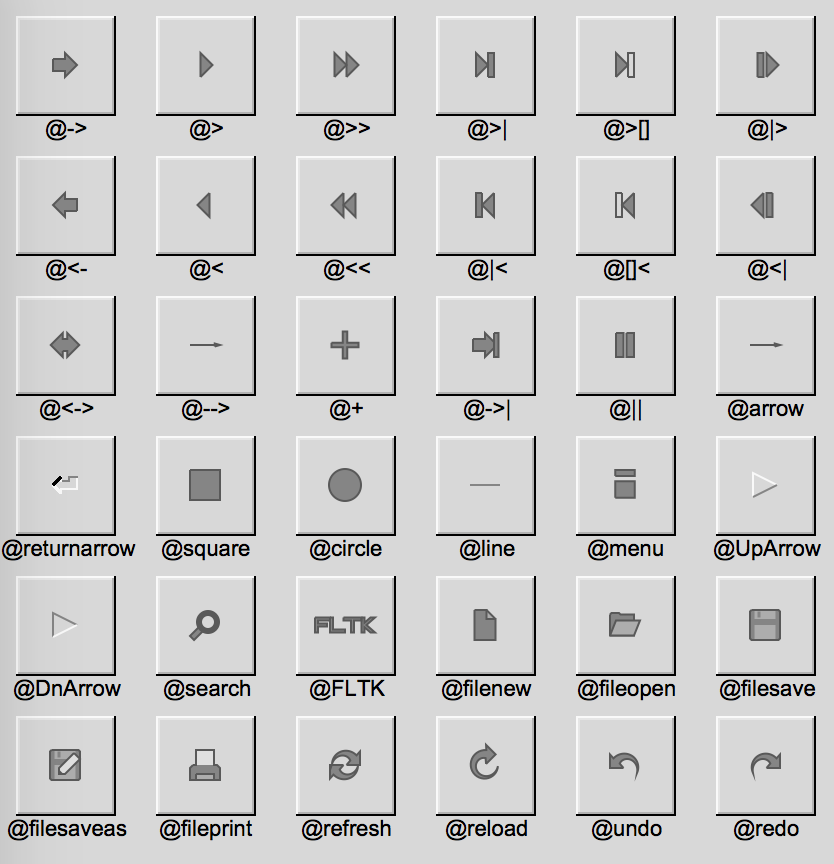
The @ sign may also be followed by the following optional "formatting" characters, in this order:
- '#' forces square scaling, rather than distortion to the widget's shape.
- +[1-9] or -[1-9] tweaks the scaling a little bigger or smaller.
- '$' flips the symbol horizontally, '%' flips it vertically.
- [0-9] - rotates by a multiple of 45 degrees. '5' and '6' do no rotation while the others point in the direction of that key on a numeric keypad. '0', followed by four more digits rotates the symbol by that amount in degrees.
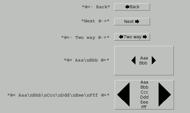
Thus, to show a very large arrow pointing downward you would use the label string "@+92->".
Symbols and text can be combined in a label, however the symbol must be at the beginning and/or at the end of the text. If the text spans multiple lines, the symbol or symbols will scale up to match the height of all the lines:
Group widgets
These are container widgets which include Window types and others found in the group module: Group, Scroll, Pack, Tile, Flex ...etc.
Widgets implementing the GroupExt trait, are characterized by having to call ::end() method to basically close them.
use fltk::{
    app,
    button::Button,
    prelude::{GroupExt, WidgetBase, WidgetExt},
    window::Window,
};

fn main() {
    let a = app::App::default();
    let mut win = Window::default().with_size(400, 300);
    let _btn = Button::new(160, 200, 80, 30, "Click");
    win.end();
    win.show();
    a.run().unwrap();
}
In the above example, the button btn will be parented by the window.
After ending such GroupExt widgets, any other widgets instantiated after the end call, will be instantiated outside.
These can still be added using the ::add(&other_widget) method (or using ::insert):
use fltk::{
    app,
    button::Button,
    prelude::{GroupExt, WidgetBase, WidgetExt},
    window::Window,
};

fn main() {
    let a = app::App::default();
    let mut win = Window::default().with_size(400, 300);
    win.end();
    win.show();

    let btn = Button::new(160, 200, 80, 30, "Click");
    win.add(&btn);

    a.run().unwrap();
}
Another option is to reopen the widget:
use fltk::{
    app,
    button::Button,
    prelude::{GroupExt, WidgetBase, WidgetExt},
    window::Window,
};

fn main() {
    let a = app::App::default();
    let mut win = Window::default().with_size(400, 300);
    win.end();
    win.show();

    win.begin();
    let _btn = Button::new(160, 200, 80, 30, "Click");
    win.end();

    a.run().unwrap();
}
While most GroupExt widgets require manual layouts, several have automatic layouting. The Flex widget was discussed in the layouts page. Packs require the width or height of the child widget, depending on the Pack's orientation.
A vertical Pack needs to know only the heights of its children:
use fltk::{prelude::*, *};

fn main() {
    let app = app::App::default();
    let mut wind = window::Window::default().with_size(200, 300);
    let mut pack = group::Pack::default_fill();
    pack.set_spacing(5);
    for i in 0..2 {
        frame::Frame::default().with_size(0, 40).with_label(&format!("field {}", i));
        input::Input::default().with_size(0, 40);
    }
    frame::Frame::default().with_size(0, 40); // a filler
    button::Button::default().with_size(0, 40).with_label("Submit");
    pack.end();
    wind.end();
    wind.show();

    app.run().unwrap();
}

For a horizontal pack, we set the Pack type, then we only need to pass the widths of the children:
use fltk::{prelude::*, *};

fn main() {
    let app = app::App::default();
    let mut wind = window::Window::default().with_size(300, 100);
    let mut pack = group::Pack::default_fill().with_type(group::PackType::Horizontal);
    pack.set_spacing(5);
    for i in 0..2 {
        frame::Frame::default().with_size(40, 0).with_label(&format!("field {}", i));
        input::Input::default().with_size(40, 0);
    }
    frame::Frame::default().with_size(40, 0); // a filler
    button::Button::default().with_size(40, 0).with_label("Submit");
    pack.end();
    wind.end();
    wind.show();

    app.run().unwrap();
}
Menus
Menus in FLTK are widgets which implement the MenuExt trait. To that end, there are several types:
- MenuBar
- MenuButton
- MenuItem
- Choice dropdown list
- SysMenuBar MacOS menu bar which appears at the top of the screen
- MacAppMenu
Menu types function in 2 main ways:
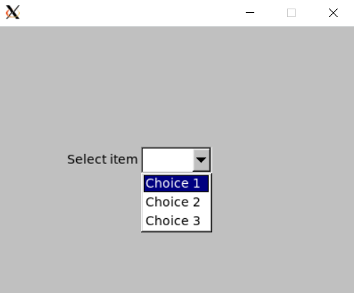
1- Add choices using the add_choice() method, then handling the user's selection in the callback:
use fltk::{prelude::*, *};

fn main() {
    let app = app::App::default();
    let mut wind = window::Window::default().with_size(400, 300);
    let mut choice = menu::Choice::default().with_size(80, 30).center_of_parent().with_label("Select item");
    choice.add_choice("Choice 1");
    choice.add_choice("Choice 2");
    choice.add_choice("Choice 3");
    // You can also simply type choice.add_choice("Choice 1|Choice 2|Choice 3");
    wind.end();
    wind.show();

    choice.set_callback(|c| {
        match c.value() {
            0 => println!("choice 1 selected"),
            1 => println!("choice 2 selected"),
            2 => println!("choice 3 selected"),
            _ => unreachable!(),
        }
    });

    app.run().unwrap();
}
Alternatively you can query the textual value of the selected item:
use fltk::{prelude::*, *};

fn main() {
    let app = app::App::default();
    let mut wind = window::Window::default().with_size(400, 300);
    let mut choice = menu::Choice::default().with_size(80, 30).center_of_parent().with_label("Select item");
    choice.add_choice("Choice 1|Choice 2|Choice 3");
    wind.end();
    wind.show();

    choice.set_callback(|c| {
        if let Some(choice) = c.choice() {
            match choice.as_str() {
                "Choice 1" => println!("choice 1 selected"),
                "Choice 2" => println!("choice 2 selected"),
                "Choice 3" => println!("choice 3 selected"),
                _ => unreachable!(),
            }
        }
    });

    app.run().unwrap();
}
2- Adding choices via the add() method, you pass each choice's callback distinctively.
use fltk::{prelude::*, *};

fn main() {
    let app = app::App::default();
    let mut wind = window::Window::default().with_size(400, 300);
    let mut choice = menu::Choice::default()
        .with_size(80, 30)
        .center_of_parent()
        .with_label("Select item");

    choice.add(
        "Choice 1",
        enums::Shortcut::None,
        menu::MenuFlag::Normal,
        |_| println!("choice 1 selected"),
    );
    choice.add(
        "Choice 2",
        enums::Shortcut::None,
        menu::MenuFlag::Normal,
        |_| println!("choice 2 selected"),
    );
    choice.add(
        "Choice 3",
        enums::Shortcut::None,
        menu::MenuFlag::Normal,
        |_| println!("choice 3 selected"),
    );

    wind.end();
    wind.show();

    app.run().unwrap();
}
Also as mentioned in the Events section, you can use a function object instead of passing closures:
use fltk::{enums::*, prelude::*, *};

fn menu_cb(m: &mut impl MenuExt) {
    if let Some(choice) = m.choice() {
        match choice.as_str() {
            "New\t" => println!("New"),
            "Open\t" => println!("Open"),
            "Third" => println!("Third"),
            "Quit\t" => {
                println!("Quitting");
                app::quit();
            },
            _ => println!("{}", choice),
        }
    }
}

fn main() {
    let a = app::App::default();
    let mut win = window::Window::default().with_size(400, 300);
    let mut menubar = menu::MenuBar::new(0, 0, 400, 40, "rew");
    menubar.add("File/New\t", Shortcut::None, menu::MenuFlag::Normal, menu_cb);
    menubar.add(
        "File/Open\t",
        Shortcut::None,
        menu::MenuFlag::Normal,
        menu_cb,
    );
    let idx = menubar.add(
        "File/Recent",
        Shortcut::None,
        menu::MenuFlag::Submenu,
        menu_cb,
    );
    menubar.add(
        "File/Recent/First\t",
        Shortcut::None,
        menu::MenuFlag::Normal,
        menu_cb,
    );
    menubar.add(
        "File/Recent/Second\t",
        Shortcut::None,
        menu::MenuFlag::Normal,
        menu_cb,
    );
    menubar.add(
        "File/Quit\t",
        Shortcut::None,
        menu::MenuFlag::Normal,
        menu_cb,
    );
    let mut btn1 = button::Button::new(160, 150, 80, 30, "Modify 1");
    let mut btn2 = button::Button::new(160, 200, 80, 30, "Modify 2");
    let mut clear = button::Button::new(160, 250, 80, 30, "Clear");
    win.end();
    win.show();

    btn1.set_callback({
        let menubar = menubar.clone();
        move |_| {
            if let Some(mut item) = menubar.find_item("File/Recent") {
                item.add(
                    "Recent/Third",
                    Shortcut::None,
                    menu::MenuFlag::Normal,
                    menu_cb,
                );
                item.add(
                    "Recent/Fourth",
                    Shortcut::None,
                    menu::MenuFlag::Normal,
                    menu_cb,
                );
            }
        }
    });

    btn2.set_callback({
        let mut menubar = menubar.clone();
        move |_| {
            menubar.add(
                "File/Recent/Fifth\t",
                Shortcut::None,
                menu::MenuFlag::Normal,
                menu_cb,
            );
            menubar.add(
                "File/Recent/Sixth\t",
                Shortcut::None,
                menu::MenuFlag::Normal,
                menu_cb,
            );
        }
    });

    clear.set_callback(move |_| {
        menubar.clear_submenu(idx).unwrap();
    });

    a.run().unwrap();
}
Alternatively, you can use the add_emit() to pass a Sender and a message instead of passing callbacks:
use fltk::{prelude::*, *};

#[derive(Clone)]
enum Message {
    Choice1,
    Choice2,
    Choice3,
}

fn main() {
    let a = app::App::default();
    let (s, r) = app::channel();
    let mut wind = window::Window::default().with_size(400, 300);
    let mut choice = menu::Choice::default()
        .with_size(80, 30)
        .center_of_parent()
        .with_label("Select item");

    choice.add_emit(
        "Choice 1",
        enums::Shortcut::None,
        menu::MenuFlag::Normal,
        s.clone(),
        Message::Choice1,
    );
    choice.add_emit(
        "Choice 2",
        enums::Shortcut::None,
        menu::MenuFlag::Normal,
        s.clone(),
        Message::Choice2,
    );
    choice.add_emit(
        "Choice 3",
        enums::Shortcut::None,
        menu::MenuFlag::Normal,
        s,
        Message::Choice3,
    );

    wind.end();
    wind.show();

    while a.wait() {
        if let Some(msg) = r.recv() {
            match msg {
                Message::Choice1 => println!("choice 1 selected"),
                Message::Choice2 => println!("choice 2 selected"),
                Message::Choice3 => println!("choice 3 selected"),
            }
        }
    }
}
You might wonder, why go from a handful of lines in the first examples to a more complex manner of doing things. Each method has it's uses. For simple drop down widgets, go with the first method. For an application's menu bar, go with the second. It allows you to specify Shortcuts and MenuFlags, and allows better decoupling of events, so you won't have to handle everything in the menu's callback. It's also easier to deal with submenus using the add() method, as in the editor example:
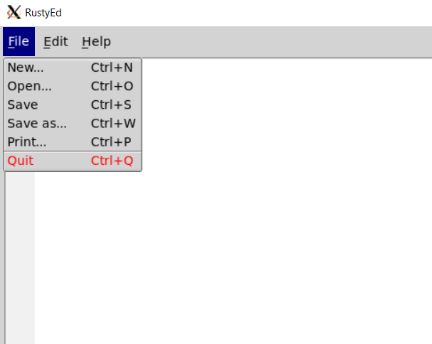
#![allow(unused)]
fn main() {
        let mut menu = menu::SysMenuBar::default().with_size(800, 35);
        menu.set_frame(FrameType::FlatBox);
        menu.add_emit(
            "&File/New...\t",
            Shortcut::Ctrl | 'n',
            menu::MenuFlag::Normal,
            *s,
            Message::New,
        );

        menu.add_emit(
            "&File/Open...\t",
            Shortcut::Ctrl | 'o',
            menu::MenuFlag::Normal,
            *s,
            Message::Open,
        );

        menu.add_emit(
            "&File/Save\t",
            Shortcut::Ctrl | 's',
            menu::MenuFlag::Normal,
            *s,
            Message::Save,
        );

        menu.add_emit(
            "&File/Save as...\t",
            Shortcut::Ctrl | 'w',
            menu::MenuFlag::Normal,
            *s,
            Message::SaveAs,
        );

        menu.add_emit(
            "&File/Print...\t",
            Shortcut::Ctrl | 'p',
            menu::MenuFlag::MenuDivider,
            *s,
            Message::Print,
        );

        menu.add_emit(
            "&File/Quit\t",
            Shortcut::Ctrl | 'q',
            menu::MenuFlag::Normal,
            *s,
            Message::Quit,
        );

        menu.add_emit(
            "&Edit/Cut\t",
            Shortcut::Ctrl | 'x',
            menu::MenuFlag::Normal,
            *s,
            Message::Cut,
        );

        menu.add_emit(
            "&Edit/Copy\t",
            Shortcut::Ctrl | 'c',
            menu::MenuFlag::Normal,
            *s,
            Message::Copy,
        );

        menu.add_emit(
            "&Edit/Paste\t",
            Shortcut::Ctrl | 'v',
            menu::MenuFlag::Normal,
            *s,
            Message::Paste,
        );

        menu.add_emit(
            "&Help/About\t",
            Shortcut::None,
            menu::MenuFlag::Normal,
            *s,
            Message::About,
        );

        if let Some(mut item) = menu.find_item("&File/Quit\t") {
            item.set_label_color(Color::Red);
        }
}
Also notice the last call, which uses find_item() to find an item in the menu, and we hence set its label color to red.
System Menu Bar
On MacOS, you might prefer to use a system menu bar, which typically appears on the top of the screen. For that, you can use a SysMenuBar widget. This has the same api as all widgets implementing MenuExt, and it translates into a normal MenuBar when the app is compiled for other targets than a MacOS.
Input & Output
Input and Output widgets implement the InputExt trait. These are found between the input and output modules:
- Input
- IntInput
- FloatInput
- MultilineInput
- SecretInput
- FileInput
- Output
- MultilineOutput
The hallmark of this trait is that these widgets have a textual value which can be queried using the value() method, and changed using the set_value() method:
use fltk::{prelude::*, *};

fn main() {
    let a = app::App::default();
    let mut win = window::Window::default().with_size(400, 300);
    let flex = group::Flex::default().with_size(100, 100).column().center_of_parent();
    let label = frame::Frame::default().with_label("Enter age");
    let input = input::IntInput::default();
    let mut btn = button::Button::default().with_label("Submit");
    flex.end();
    win.end();
    win.show();

    btn.set_callback(move |btn| {
        println!("your age is {}", input.value());
    });

    a.run().unwrap();
}

Notice that we used an IntInput to limit ourselves to integral values. Even though for the user they can't enter strings, the return of value() is still a String as far as the developer is concerned.
Output widgets don't allow the user to modify their values:
use fltk::{prelude::*, *};

fn main() {
    let a = app::App::default();
    let mut win = window::Window::default().with_size(400, 300);
    let flex = group::Flex::default().with_size(200, 50).column().center_of_parent();
    let label = frame::Frame::default().with_label("Check this text:");
    let mut output = output::Output::default();
    output.set_value("You can't edit this!");
    flex.end();
    win.end();
    win.show();
    a.run().unwrap();
}

Input widgets also support being made read-only using the InputExt::set_readonly(bool) method:
use fltk::{prelude::*, *};

fn main() {
    let a = app::App::default();
    let mut win = window::Window::default().with_size(400, 300);
    let flex = group::Flex::default().with_size(100, 100).column().center_of_parent();
    let label = frame::Frame::default().with_label("Enter age");
    let mut input = input::IntInput::default();
    let mut btn = button::Button::default().with_label("Submit");
    flex.end();
    win.end();
    win.show();

    btn.set_callback(move |btn| {
        println!("your age is {}", input.value());
        input.set_readonly(true);
    });

    a.run().unwrap();
}
This makes our input read-only once the user hits the button.
Valuators
Valuator widgets implement the ValuatorExt trait. These keep track (graphically and internally) of numerical values along with steps, ranges and bounds. Such valuators which you might be familiar with are scrollbars and sliders. The list offered by fltk is found in the valuator module:
- Slider
- NiceSlider
- ValueSlider
- Dial
- LineDial
- Counter
- Scrollbar
- Roller
- Adjuster
- ValueInput
- ValueOutput
- FillSlider
- FillDial
- HorSlider (Horizontal slider)
- HorFillSlider
- HorNiceSlider
- HorValueSlider
Changing the valuator's value in the gui triggers its callback. The current value of the valuator can be queried using the value() method. It can also be set using set_value(). The ranges and step can also be queried and changed to your use case:
use fltk::{prelude::*, *};

fn main() {
    let a = app::App::default();
    let mut win = window::Window::default().with_size(400, 300);
    let mut slider = valuator::HorNiceSlider::default().with_size(400, 20).center_of_parent();
    slider.set_minimum(0.);
    slider.set_maximum(100.);
    slider.set_step(1., 1); // increment by 1.0 at each 1 step
    slider.set_value(50.); // start in the middle
    win.end();
    win.show();

    slider.set_callback(|s| {
        println!("slider at {}", s.value());
    });
    a.run().unwrap();
}

Below you can see the same example using different valuator widgets.
Valuator widgets examples
Adjuster widget

Counter widget

Dial widget

FillDial widget

FillSlider widget

HorFillSlider widget

HorNiceSlider widget

HorSlider widget

HorValueSlider widget

LineDial widget

NiceSlider widget

Roller widget

Scrollbar widget

Slider widget

ValueInput widget

ValueOutput widget

ValueSlider widget

Valuator enums
Some valuators offer different types which can be set using the set_type method (or with_type builder function). The value passed is an enum value of <Widget>Type usually.
In the following example, we instantiate a Counter, then set its type to a Simple counter.
#![allow(unused)]
fn main() {
let mut counter = valuator::Counter::default().with_size(200, 50).center_of_parent();
counter.set_type(fltk::valuator::CounterType::Simple);
}
Check below for more types associated with different valuator widgets.
Valuator type enums examples
CounterType::Normal

CounterType::Simple

DialType::Normal

DialType::Line

DialType::Fill

ScrollbarType::Vertical

ScrollbarType::Horizontal

ScrollbarType::VerticalFill

ScrollbarType::HorizontalFill

ScrollbarType::VerticalNice

ScrollbarType::HorizontalNice

SliderType::Vertical

SliderType::VerticalFill

SliderType::HorizontalFill

SliderType::VerticalNice

SliderType::HorizontalNice

Text
Text widgets are those that implement the DisplayExt. There are 3 and these can be found in the text module:
- TextDisplay
- TextEditor
- SimpleTerminal
The main purpose of these widgets is displaying/editing text. The first 2 widgets require a TextBuffer, while the SimpleTerminal has an internal buffer:
use fltk::{prelude::*, *};

fn main() {
    let a = app::App::default();
    let mut buf = text::TextBuffer::default();

    let mut win = window::Window::default().with_size(400, 300);
    let mut txt = text::TextEditor::default().with_size(390, 290).center_of_parent();
    txt.set_buffer(buf.clone());
    win.end();
    win.show();

    buf.set_text("Hello world!");
    buf.append("\n");
    buf.append("This is a text editor!");

    a.run().unwrap();
}

Most operations are done through the TextBuffer. Text can be appended using append() or the whole content can be set using set_text(). You can get back a clone (reference type) of the buffer using the DisplayExt::buffer() method:
use fltk::{prelude::*, *};

fn main() {
    let a = app::App::default();
    let buf = text::TextBuffer::default();

    let mut win = window::Window::default().with_size(400, 300);
    let mut txt = text::TextEditor::default().with_size(390, 290).center_of_parent();
    txt.set_buffer(buf);
    win.end();
    win.show();

    let mut my_buf = txt.buffer().unwrap();

    my_buf.set_text("Hello world!");
    my_buf.append("\n");
    my_buf.append("This is a text editor!");

    a.run().unwrap();
}
The DisplayExt offers other methods to manage the text properties such as wrapping, cursor position, font, color, size...etc:
use fltk::{enums::Color, prelude::*, *};

fn main() {
    let a = app::App::default();
    let mut buf = text::TextBuffer::default();
    buf.set_text("Hello world!");
    buf.append("\n");
    buf.append("This is a text editor!");

    let mut win = window::Window::default().with_size(400, 300);
    let mut txt = text::TextDisplay::default().with_size(390, 290).center_of_parent();
    txt.set_buffer(buf);
    txt.wrap_mode(text::WrapMode::AtBounds, 0); // bounds don't require the second argument, unlike AtPixel and AtColumn
    txt.set_text_color(Color::Red);
    win.end();
    win.show();

    a.run().unwrap();
}

The TextBuffer has also a second purpose, and that's to provide a style buffer. A style buffer mirrors your text buffer and uses a style table (containing font, color and size) to add granular styling to your text, the style table itself is indexed, so to speak, using the corresponding letter:
use fltk::{
    enums::{Color, Font},
    prelude::*,
    *,
};

const STYLES: &[text::StyleTableEntry] = &[
    text::StyleTableEntry {
        color: Color::Green,
        font: Font::Courier,
        size: 16,
    },
    text::StyleTableEntry {
        color: Color::Red,
        font: Font::Courier,
        size: 16,
    },
    text::StyleTableEntry {
        color: Color::from_u32(0x8000ff),
        font: Font::Courier,
        size: 16,
    },
];

fn main() {
    let a = app::App::default();
    let mut buf = text::TextBuffer::default();
    let mut sbuf = text::TextBuffer::default();
    buf.set_text("Hello world!");
    sbuf.set_text(&"A".repeat("Hello world!".len())); // A represents the first entry in the table, repeated for every letter
    buf.append("\n");
    sbuf.append("B"); // Although a new line and the style might not apply, but it's needed to avoid messing out subsequent entries
    buf.append("This is a text editor!");
    sbuf.append(&"C".repeat("This is a text editor!".len()));

    let mut win = window::Window::default().with_size(400, 300);
    let mut txt = text::TextDisplay::default()
        .with_size(390, 290)
        .center_of_parent();
    txt.set_buffer(buf);
    txt.set_highlight_data(sbuf, STYLES.to_vec());
    win.end();
    win.show();

    a.run().unwrap();
}

The terminal example uses the SimpleTerminal along with a style TextBuffer. It can be found here
Browsers
Browser widgets implement the BrowserExt trait:
- Browser
- SelectBrowser
- HoldBrowser
- MultiBrowser
- FileBrowser
- CheckBrowser
These can be found in the browser module.
To instantiate a browser, it also needs the column widths, as well as the separator char that will be used in the add() method to separate items into columns:
use fltk::{prelude::*, *};

fn main() {
    let app = app::App::default();
    let mut win = window::Window::default().with_size(900, 300);
    let mut b = browser::Browser::new(10, 10, 900 - 20, 300 - 20, "");
    let widths = &[50, 50, 50, 70, 70, 40, 40, 70, 70, 50];
    b.set_column_widths(widths);
    b.set_column_char('\t');
    // we can now use the '\t' char in our add method.
    b.add("USER\tPID\t%CPU\t%MEM\tVSZ\tRSS\tTTY\tSTAT\tSTART\tTIME\tCOMMAND");
    b.add("root\t2888\t0.0\t0.0\t1352\t0\ttty3\tSW\tAug15\t0:00\t@b@f/sbin/mingetty tty3");
    b.add("erco\t2889\t0.0\t13.0\t221352\t0\ttty3\tR\tAug15\t1:34\t@b@f/usr/local/bin/render a35 0004");
    b.add("uucp\t2892\t0.0\t0.0\t1352\t0\tttyS0\tSW\tAug15\t0:00\t@b@f/sbin/agetty -h 19200 ttyS0 vt100");
    b.add("root\t13115\t0.0\t0.0\t1352\t0\ttty2\tSW\tAug30\t0:00\t@b@f/sbin/mingetty tty2");
    b.add(
        "root\t13464\t0.0\t0.0\t1352\t0\ttty1\tSW\tAug30\t0:00\t@b@f/sbin/mingetty tty1 --noclear",
    );
    win.end();
    win.show();
    app.run().unwrap();
}

To gain additional formatting, we can use special character @ followed by a formatting specifier:
- '@.' Print rest of line, don't look for more '@' signs
- '@@' Print rest of line starting with '@'
- '@l' Use a LARGE (24 point) font
- '@m' Use a medium large (18 point) font
- '@s' Use a small (11 point) font
- '@b' Use a bold font (adds FL_BOLD to font)
- '@i' Use an italic font (adds FL_ITALIC to font)
- '@f' or '@t' Use a fixed-pitch font (sets font to FL_COURIER)
- '@c' Center the line horizontally
- '@r' Right-justify the text
- '@B0', '@B1', ... '@B255' Fill the backgound with fl_color(n)
- '@C0', '@C1', ... '@C255' Use fl_color(n) to draw the text
- '@F0', '@F1', ... Use fl_font(n) to draw the text
- '@S1', '@S2', ... Use point size n to draw the text
- '@u' or '@_' Underline the text.
- '@-' draw an engraved line through the middle.
In the following example, we color %CPU to red by preceding it with @C88:
use fltk::{prelude::*, *};

fn main() {
    let app = app::App::default();
    let mut win = window::Window::default().with_size(900, 300);
    let mut b = browser::Browser::new(10, 10, 900 - 20, 300 - 20, "");
    let widths = &[50, 50, 50, 70, 70, 40, 40, 70, 70, 50];
    b.set_column_widths(widths);
    b.set_column_char('\t');
    b.add("USER\tPID\t@C88%CPU\t%MEM\tVSZ\tRSS\tTTY\tSTAT\tSTART\tTIME\tCOMMAND");
    win.end();
    win.show();
    app.run().unwrap();
}

The colors follow FLTK's colormap, which can be indexed from 0 to 255:

Trees
Tree widgets allow showing items in a tree! There's no tree trait, all methods belong to the Tree type. Items are added using the add method:
use fltk::{prelude::*, *};

fn main() {
    let a = app::App::default();
    let mut win = window::Window::default().with_size(400, 300);
    let mut tree = tree::Tree::default().with_size(390, 290).center_of_parent();
    tree.add("Item 1");
    tree.add("Item 2");
    tree.add("Item 3");
    win.end();
    win.show();

    a.run().unwrap();
}

Sub-items are added by using the forward slash separator:
use fltk::{prelude::*, *};

fn main() {
    let a = app::App::default();
    let mut win = window::Window::default().with_size(400, 300);
    let mut tree = tree::Tree::default().with_size(390, 290).center_of_parent();
    tree.add("Item 1");
    tree.add("Item 2");
    tree.add("Item 3");
    tree.add("Item 3/Subitem 1");
    tree.add("Item 3/Subitem 2");
    tree.add("Item 3/Subitem 3");
    win.end();
    win.show();

    a.run().unwrap();
}

If you try the above code, you'll see that the root item is always indicated by the label "ROOT". This can be changed using the set_root_label() method:
use fltk::{prelude::*, *};

fn main() {
    let a = app::App::default();
    let mut win = window::Window::default().with_size(400, 300);
    let mut tree = tree::Tree::default().with_size(390, 290).center_of_parent();
    tree.set_root_label("My Tree");
    tree.add("Item 1");
    tree.add("Item 2");
    tree.add("Item 3");
    tree.add("Item 3/Subitem 1");
    tree.add("Item 3/Subitem 2");
    tree.add("Item 3/Subitem 3");
    win.end();
    win.show();

    a.run().unwrap();
}

Or even hidden using the set_show_root(false) method.
Items can be queried using the first_selected_item() method:
use fltk::{prelude::*, *};

fn main() {
    let a = app::App::default();
    let mut win = window::Window::default().with_size(400, 300);
    let mut tree = tree::Tree::default().with_size(390, 290).center_of_parent();
    tree.set_show_root(false);
    tree.add("Item 1");
    tree.add("Item 2");
    tree.add("Item 3");
    tree.add("Item 3/Subitem 1");
    tree.add("Item 3/Subitem 2");
    tree.add("Item 3/Subitem 3");
    win.end();
    win.show();


    tree.set_callback(|t| {
        if let Some(item) = t.first_selected_item() {
            println!("{} selected", item.label().unwrap());
        }
    });

    a.run().unwrap();
}

Currently our tree only allow single selection, let's change it to multiple (we'll also change the connector style while we're at it):
use fltk::{prelude::*, *};

fn main() {
    let a = app::App::default();
    let mut win = window::Window::default().with_size(400, 300);
    let mut tree = tree::Tree::default().with_size(390, 290).center_of_parent();
    tree.set_select_mode(tree::TreeSelect::Multi);
    tree.set_connector_style(tree::TreeConnectorStyle::Solid);
    tree.set_connector_color(enums::Color::Red.inactive());
    tree.set_show_root(false);
    tree.add("Item 1");
    tree.add("Item 2");
    tree.add("Item 3");
    tree.add("Item 3/Subitem 1");
    tree.add("Item 3/Subitem 2");
    tree.add("Item 3/Subitem 3");
    win.end();
    win.show();


    tree.set_callback(|t| {
        if let Some(item) = t.first_selected_item() {
            println!("{} selected", item.label().unwrap());
        }
    });

    a.run().unwrap();
}
The problem now is that we need to get the whole selection instead only of the first selected item, so we'll use the get_selected_items() method which returns an optional Vec, and instead of just getting the label, we'll get the whole path of the item:
use fltk::{prelude::*, *};

fn main() {
    let a = app::App::default();
    let mut win = window::Window::default().with_size(400, 300);
    let mut tree = tree::Tree::default().with_size(390, 290).center_of_parent();
    tree.set_select_mode(tree::TreeSelect::Multi);
    tree.set_connector_style(tree::TreeConnectorStyle::Solid);
    tree.set_connector_color(enums::Color::Red.inactive());
    tree.set_show_root(false);
    tree.add("Item 1");
    tree.add("Item 2");
    tree.add("Item 3");
    tree.add("Item 3/Subitem 1");
    tree.add("Item 3/Subitem 2");
    tree.add("Item 3/Subitem 3");
    win.end();
    win.show();


    tree.set_callback(|t| {
        if let Some(items) = t.get_selected_items() {
            for i in items {
                println!("{} selected", t.item_pathname(&i).unwrap());
            }
        }
    });

    a.run().unwrap();
}

Tables
fltk offers a table widget, the use code for which can be found in the examples. However, using the fltk-table crate would require much less boilerplate code and also offers an easier and more intuitive interface:
extern crate fltk_table;

use fltk::{
    app, enums,
    prelude::{GroupExt, WidgetExt},
    window,
};
use fltk_table::{SmartTable, TableOpts};

fn main() {
    let app = app::App::default().with_scheme(app::Scheme::Gtk);
    let mut wind = window::Window::default().with_size(800, 600);

    /// We pass the rows and columns thru the TableOpts field
    let mut table = SmartTable::default()
    .with_size(790, 590)
    .center_of_parent()
    .with_opts(TableOpts {
        rows: 30,
        cols: 15,
        editable: true,
        ..Default::default()
    });

    wind.end();
    wind.show();

    // Just filling the vec with some values
    for i in 0..30 {
        for j in 0..15 {
            table.set_cell_value(i, j, &(i + j).to_string());
        }
    }

    // set the value at the row,column 4,5 to "another", notice that indices start at 0
    table.set_cell_value(3, 4, "another");

    assert_eq!(table.cell_value(3, 4), "another");

    // To avoid closing the window on hitting the escape key
    wind.set_callback(move |_| {
        if app::event() == enums::Event::Close {
            app.quit();
        }
    });

    app.run().unwrap();
}

Custom widgets
fltk-rs allows you to create custom widgets. We need to define a struct which extends an already existing widget and widget type. The most basic widget type being widget::Widget. 1- Define your struct and whatever other internal data needs to be stored in it.
#![allow(unused)]
fn main() {
use fltk::{prelude::*, *};
use std::cell::RefCell;
use std::rc::Rc;

struct MyCustomButton {
    inner: widget::Widget,
    num_clicks: Rc<RefCell<i32>>,
}
}
You'll notice 2 things, we're using an Rc RefCell for the data we're storing. This isn't necessary in the general case, however, since we need to move that data into a callback, while still having access to it after we mutate it, we'll wrap it in an Rc RefCell. We've imported the necessary modules.
2- Define the implementation of your struct. The most important of these being the constructor since it's how we'll initialize the internal data as well:
#![allow(unused)]
fn main() {
impl MyCustomButton {
    // our constructor
    pub fn new(radius: i32, label: &str) -> Self {
        let mut inner = widget::Widget::default()
            .with_size(radius * 2, radius * 2)
            .with_label(label)
            .center_of_parent();
        inner.set_frame(enums::FrameType::OFlatBox);
        let num_clicks = 0;
        let num_clicks = Rc::from(RefCell::from(num_clicks));
        let clicks = num_clicks.clone();
        inner.draw(|i| { // we need a draw implementation
            draw::draw_box(i.frame(), i.x(), i.y(), i.w(), i.h(), i.color());
            draw::set_draw_color(enums::Color::Black); // for the text
            draw::set_font(enums::Font::Helvetica, app::font_size());
            draw::draw_text2(&i.label(), i.x(), i.y(), i.w(), i.h(), i.align());
        });
        inner.handle(move |i, ev| match ev {
            enums::Event::Push => {
                *clicks.borrow_mut() += 1; // increment num_clicks
                i.do_callback(); // do the callback which we'll set using set_callback().
                true
            }
            _ => false,
        });
        Self {
            inner,
            num_clicks,
        }
    }

    // get the times our button was clicked
    pub fn num_clicks(&self) -> i32 {
        *self.num_clicks.borrow()
    }
}
}
3- Apply the widget_extends! macro to our struct, the macro requires the base type, and the member via which our custom type is extended. This is done via implementing the Deref and DerefMut traits. The macro also adds other convenience constructors and anchoring methods:
#![allow(unused)]
fn main() {
// Extend widget::Widget via the member `inner` and add other initializers and constructors
widget_extends!(MyCustomButton, widget::Widget, inner);
}
Now we're ready to try out our struct:
fn main() {
    let app = app::App::default().with_scheme(app::Scheme::Gleam);
    app::background(255, 255, 255); // make the background white
    let mut wind = window::Window::new(100, 100, 400, 300, "Hello from rust");

    let mut btn = MyCustomButton::new(50, "Click");
    // notice that set_color and set_callback are automatically implemented for us!
    btn.set_color(enums::Color::Cyan);
    btn.set_callback(|_| println!("Clicked"));

    wind.end();
    wind.show();

    app.run().unwrap();

    // print the number our button was clicked on exit
    println!("Our button was clicked {} times", btn.num_clicks());
}
Full code:
use fltk::{prelude::*, *};
use std::cell::RefCell;
use std::rc::Rc;

struct MyCustomButton {
    inner: widget::Widget,
    num_clicks: Rc<RefCell<i32>>,
}

impl MyCustomButton {
    // our constructor
    pub fn new(radius: i32, label: &str) -> Self {
        let mut inner = widget::Widget::default()
            .with_size(radius * 2, radius * 2)
            .with_label(label)
            .center_of_parent();
        inner.set_frame(enums::FrameType::OFlatBox);
        let num_clicks = 0;
        let num_clicks = Rc::from(RefCell::from(num_clicks));
        let clicks = num_clicks.clone();
        inner.draw(|i| { // we need a draw implementation
            draw::draw_box(i.frame(), i.x(), i.y(), i.w(), i.h(), i.color());
            draw::set_draw_color(enums::Color::Black); // for the text
            draw::set_font(enums::Font::Helvetica, app::font_size());
            draw::draw_text2(&i.label(), i.x(), i.y(), i.w(), i.h(), i.align());
        });
        inner.handle(move |i, ev| match ev {
            enums::Event::Push => {
                *clicks.borrow_mut() += 1; // increment num_clicks
                i.do_callback(); // do the callback which we'll set using set_callback().
                true
            }
            _ => false,
        });
        Self {
            inner,
            num_clicks,
        }
    }

    // get the times our button was clicked
    pub fn num_clicks(&self) -> i32 {
        *self.num_clicks.borrow()
    }
}

// Extend widget::Widget via the member `inner` and add other initializers and constructors
widget_extends!(MyCustomButton, widget::Widget, inner);

fn main() {
    let app = app::App::default().with_scheme(app::Scheme::Gleam);
    app::background(255, 255, 255); // make the background white
    let mut wind = window::Window::new(100, 100, 400, 300, "Hello from rust");
    let mut btn = MyCustomButton::new(50, "Click");
    btn.set_color(enums::Color::Cyan);
    btn.set_callback(|_| println!("Clicked"));
    wind.end();
    wind.show();

    app.run().unwrap();

    // print the number our button was clicked on exit
    println!("Our button was clicked {} times", btn.num_clicks());
}

Dialogs
fltk offers several dialog types including file dialogs and others.
File dialogs
There are 2 types, the native file dialog and FLTK's own file dialog. Native dialogs just show a the OS's own dialog. For windows, that's the win32 dialog, for MacOS, that's the Cocoa dialog, and for other posix systems, it depends on what you're running. On GNOME and other gtk-based desktops, it shows the gtk dialog and on KDE it shows kdialog.
Native dialogs
To spawn a native dialog:
use fltk::{prelude::*, *};

fn main() {
    let app = app::App::default();
    let mut wind = window::Window::default().with_size(400, 300);

    let mut btn = button::Button::default()
        .with_size(80, 30)
        .with_label("Select file")
        .center_of_parent();

    wind.end();
    wind.show();

    btn.set_callback(|_| {
        let mut dialog = dialog::NativeFileChooser::new(dialog::NativeFileChooserType::BrowseFile);
        dialog.show();
        println!("{:?}", dialog.filename());
    });

    app.run().unwrap();
}

This prints the Path of the chosen file. There are several types which can be passed as NativeFileChooserType, here we browse files, you can choose to BrowseDir instead, also enable mutli file/dir selection. If you select multiple files, you can get a Vec using the filenames() method:
use fltk::{prelude::*, *};

fn main() {
    let app = app::App::default();
    let mut wind = window::Window::default().with_size(400, 300);

    let mut btn = button::Button::default()
        .with_size(100, 30)
        .with_label("Select files")
        .center_of_parent();

    wind.end();
    wind.show();

    btn.set_callback(|_| {
        let mut dialog = dialog::NativeFileChooser::new(dialog::NativeFileChooserType::BrowseMultiFile);
        dialog.show();
        println!("{:?}", dialog.filenames());
    });

    app.run().unwrap();
}
You can also add filter the files to show:
#![allow(unused)]
fn main() {
    btn.set_callback(|_| {
        let mut dialog = dialog::NativeFileChooser::new(dialog::NativeFileChooserType::BrowseMultiFile);
        dialog.set_filter("*.{txt,rs,toml}");
        dialog.show();
        println!("{:?}", dialog.filenames());
    });
}
This will only show .txt, .rs and .toml files.
FLTK's own file chooser
FLTK also offers its own file chooser:
use fltk::{prelude::*, *};

fn main() {
    let app = app::App::default();
    let mut wind = window::Window::default().with_size(400, 300);

    let mut btn = button::Button::default()
        .with_size(100, 30)
        .with_label("Select file")
        .center_of_parent();

    wind.end();
    wind.show();

    btn.set_callback(|_| {
        let mut dialog = dialog::FileChooser::new(
            /*start dir*/ ".",
            /*pattern*/ "*.{txt,rs,toml}",
            /*type*/ dialog::FileChooserType::Multi,
            /*title*/ "Select file:",
        );
        dialog.show();
        while dialog.shown() {
            app::wait();
        }
        if dialog.count() > 1 {
            for i in 1..=dialog.count() { // values start at 1
                println!(" VALUE[{}]: '{}'", i, dialog.value(i).unwrap());
            }
        }
    });

    app.run().unwrap();
}

A convenience function is also provided using file_chooser() and dir_chooser() functions:
use fltk::{prelude::*, *};

fn main() {
    let app = app::App::default();
    let mut wind = window::Window::default().with_size(400, 300);

    let mut btn = button::Button::default()
        .with_size(100, 30)
        .with_label("Select file")
        .center_of_parent();

    wind.end();
    wind.show();

    btn.set_callback(|_| {
        let file = dialog::file_chooser(
            "Choose File",
            "*.rs",
            /*start dir*/ ".",
            /*relative*/ true,
        );
        if let Some(file) = file {
            println!("{}", file);
        }
    });

    app.run().unwrap();
}
Help dialog
FLTK offers a help dialog which can show html 2 documents:
use fltk::{prelude::*, *};

fn main() {
    let app = app::App::default();
    let mut wind = window::Window::default().with_size(400, 300);

    let mut btn = button::Button::default()
        .with_size(100, 30)
        .with_label("Show dialog")
        .center_of_parent();

    wind.end();
    wind.show();

    btn.set_callback(|_| {
        let mut help = dialog::HelpDialog::new(100, 100, 400, 300);
        help.set_value("<h2>Hello world</h2>"); // this takes html
        help.show();
        while help.shown() {
            app::wait();
        }
    });

    app.run().unwrap();
}
The html can also be loaded using the HelpDialog::load(path_to_html_file) method.

Alert dialogs
FLTK also offers several dialog types which can be conveniently shown using free functions:
- message
- alert
- choice
- input
- password (like input but doesn't show the inputted data)
To show up a simple message dialog:
use fltk::{prelude::*, *};

fn main() {
    let app = app::App::default();
    let mut wind = window::Window::default().with_size(400, 300);

    let mut btn = button::Button::default()
        .with_size(100, 30)
        .with_label("Show dialog")
        .center_of_parent();

    wind.end();
    wind.show();

    btn.set_callback(|_| {
        dialog::message_default("Message");
    });

    app.run().unwrap();
}
This shows a message at a default location (basically near the pointer). If you would like to enter coordinates manually, you can use the message() function:
#![allow(unused)]
fn main() {
    btn.set_callback(|_| {
        dialog::message(100, 100, "Message");
    });
}
All the previously mentioned functions have 2 variants, one with _default() suffix which doesn't require coordinates, and the other without which requires coordinates. Some dialogs return a value, like choice, input, and password. Input and password return the inputted text, while choice returns an index of the chosen value:
use fltk::{prelude::*, *};

fn main() {
    let app = app::App::default();
    let mut wind = window::Window::default().with_size(400, 300);

    let mut btn = button::Button::default()
        .with_size(100, 30)
        .with_label("Show dialog")
        .center_of_parent();

    wind.end();
    wind.show();

    btn.set_callback(|_| {
        // password and input also takes a second arg which is the default value
        let pass = dialog::password_default("Enter password:", "");
        if let Some(pass) = pass {
            println!("{}", pass);
        }
    });

    app.run().unwrap();
}

An example with choice:
use fltk::{prelude::*, *};

fn main() {
    let app = app::App::default();
    let mut wind = window::Window::default().with_size(400, 300);

    let mut btn = button::Button::default()
        .with_size(100, 30)
        .with_label("Show dialog")
        .center_of_parent();

    wind.end();
    wind.show();

    btn.set_callback(|_| {
        let choice = dialog::choice_default("Would you like to save", "No", "Yes", "Cancel");
        println!("{}", choice);
    });

    app.run().unwrap();
}
This will print the index, i.e. choosing No will print 0, Yes will print 1 and Cancel will print 2.

You have noticed that all of these dialogs didn't have a title. You can add a title also using a free function called before the dialog:
#![allow(unused)]
fn main() {
        dialog::message_title("Exit!");
        let choice = dialog::choice_default("Would you like to save", "No", "Yes", "Cancel");
}
You can also set the default title of all these dialog boxes using dialog::message_title_default(), you'll want to do this in the start of your app:
use fltk::{prelude::*, *};

fn main() {
    let app = app::App::default();
    dialog::message_title_default("My App!");
    let mut wind = window::Window::default().with_size(400, 300);

    let mut btn = button::Button::default()
        .with_size(100, 30)
        .with_label("Show dialog")
        .center_of_parent();

    wind.end();
    wind.show();

    btn.set_callback(|_| {
        let choice = dialog::choice_default("Would you like to save", "No", "Yes", "Cancel");
        println!("{}", choice);
    });

    app.run().unwrap();
}

Custom dialogs
All these dialogs make assumptions about your app that might not be correct, especially regarding colors and fonts. If you have a heavily customized app you would probably also want custom dialogs. A dialog is basically a modal window which is spawned during the application. This can have the same styling as the rest of your app:
use fltk::{
    app, button,
    enums::{Color, Font, FrameType},
    frame, group, input,
    prelude::*,
    window,
};

fn style_button(btn: &mut button::Button) {
    btn.set_color(Color::Cyan);
    btn.set_frame(FrameType::RFlatBox);
    btn.clear_visible_focus();
}

pub fn show_dialog() -> MyDialog {
    MyDialog::default()
}

pub struct MyDialog {
    inp: input::Input,
}

impl MyDialog {
    pub fn default() -> Self {
        let mut win = window::Window::default()
            .with_size(400, 100)
            .with_label("My Dialog");
        win.set_color(Color::from_rgb(240, 240, 240));
        let mut pack = group::Pack::default()
            .with_size(300, 30)
            .center_of_parent()
            .with_type(group::PackType::Horizontal);
        pack.set_spacing(20);
        frame::Frame::default()
            .with_size(80, 0)
            .with_label("Enter name:");
        let mut inp = input::Input::default().with_size(100, 0);
        inp.set_frame(FrameType::FlatBox);
        let mut ok = button::Button::default().with_size(80, 0).with_label("Ok");
        style_button(&mut ok);
        pack.end();
        win.end();
        win.make_modal(true);
        win.show();
        ok.set_callback({
            let mut win = win.clone();
            move |_| {
                win.hide();
            }
        });
        while win.shown() {
            app::wait();
        }
        Self { inp }
    }
    pub fn value(&self) -> String {
        self.inp.value()
    }
}

fn main() {
    let a = app::App::default();
    app::set_font(Font::Times);
    let mut win = window::Window::default().with_size(600, 400);
    win.set_color(Color::from_rgb(240, 240, 240));
    let mut btn = button::Button::default()
        .with_size(80, 30)
        .with_label("Click")
        .center_of_parent();
    style_button(&mut btn);
    let mut frame = frame::Frame::new(btn.x() - 40, btn.y() - 100, btn.w() + 80, 30, None);
    frame.set_frame(FrameType::BorderBox);
    frame.set_color(Color::Red.inactive());
    win.end();
    win.show();
    btn.set_callback(move |_| {
        let d = show_dialog();
        frame.set_label(&d.value());
    });
    a.run().unwrap();
}

Printer dialog
FLTK also offers a printer dialog which uses your platform's native printer dialog:
#![allow(unused)]
fn main() {
use fltk::{prelude::*, *};
let mut but = button::Button::default();
but.set_callback(|widget| {
    let mut printer = printer::Printer::default();
    if printer.begin_job(1).is_ok() {
        printer.begin_page().ok();
        let (width, height) = printer.printable_rect();
        draw::set_draw_color(enums::Color::Black);
        draw::set_line_style(draw::LineStyle::Solid, 2);
        draw::draw_rect(0, 0, width, height);
        draw::set_font(enums::Font::Courier, 12);
        printer.set_origin(width / 2, height / 2);
        printer.print_widget(widget, -widget.width() / 2, -widget.height() / 2);
        printer.end_page().ok();
        printer.end_job();
    }
});
}
Here it's just printing the button's image and specifying where it shows on the paper. You can pass any widget (mostly like a TextEditor widget) as the printed widget.
Images
FLTK supports vector and raster graphics, and out of the box offers several image types, namely:
- BmpImage
- JpegImage
- GifImage
- PngImage
- SvgImage
- Pixmap
- RgbImage
- XpmImage
- XbmImage
- PnmImage
It also defines 2 more helper types:
- SharedImage: which wraps all the previous types so you don't need to specify the image type.
- TiledImage: which offers a tiled image of any of the concrete types.
Image types implement the ImageExt trait which offers methods to allow scaling, and retrieving image metadata. Images can be constructed by passing a path to the image's load() constructor, or for some types, by using a from_data() constructor which accepts image data.
#![allow(unused)]
fn main() {
/// Takes a path
let image = image::SvgImage::load("screenshots/RustLogo.svg").unwrap();

/// Takes data
let image= image::SvgImage::from_data(&data).unwrap();
}
Images can be used with widgets either via the WidgetExt::set_image()/set_image_scaled() or set_deimage()/set_deimage_scaled() (for deactivated/grayed image):
use fltk::{app, enums::FrameType, frame::Frame, image::SvgImage, prelude::*, window::Window};

fn main() {
    let app = app::App::default().with_scheme(app::Scheme::Gleam);
    let mut wind = Window::new(100, 100, 400, 300, "Hello from rust");

    let mut frame = Frame::default().with_size(360, 260).center_of(&wind);
    frame.set_frame(FrameType::EngravedBox);
    let mut image = SvgImage::load("screenshots/RustLogo.svg").unwrap();
    image.scale(200, 200, true, true);
    frame.set_image(Some(image));

    wind.make_resizable(true);
    wind.end();
    wind.show();

    app.run().unwrap();
}
Or via WidgetExt::draw() method:
use fltk::{app, enums::FrameType, frame::Frame, image::SvgImage, prelude::*, window::Window};

fn main() {
    let app = app::App::default().with_scheme(app::Scheme::Gleam);
    let mut wind = Window::new(100, 100, 400, 300, "Hello from rust");

    let mut frame = Frame::default().with_size(360, 260).center_of(&wind);
    frame.set_frame(FrameType::EngravedBox);
    let mut image = SvgImage::load("screenshots/RustLogo.svg").unwrap();
    frame.draw(move |f| {
        image.scale(f.w(), f.h(), true, true);
        image.draw(f.x() + 40, f.y(), f.w(), f.h());
    });

    wind.make_resizable(true);
    wind.end();
    wind.show();

    app.run().unwrap();
}

Using images in your app for icons and backgrounds also helps in giving your app its style.
Events
In the previously mentioned examples, you have seen callbacks mostly, and although that is one way of handling events, FLTK offers multiple ways to handle events:
- We can use the set_callback() method, which is automatically triggered with a click to our button.
- We can use the handle() method for fine-grained event handling.
- We can use the emit() method which takes a sender and a message, this allows us to handle events in the event loop.
- We can define our own event, which can be handled within another widget's handle method.
Setting the callback
Part of the WidgetExt trait is the set_callback method:
Using closures
use fltk::{prelude::*, *};

fn main() {
    let app = app::App::default();
    let mut my_window = window::Window::new(100, 100, 400, 300, "My Window");
    let mut but = button::Button::new(160, 200, 80, 40, "Click me!");
    my_window.end();
    my_window.show();
    but.set_callback(|_| println!("The button was clicked!"));
    app.run().unwrap();
}
The capture argument is the &mut Self of the widget for which the callback is set:
use fltk::{prelude::*, *};

fn main() {
    let app = app::App::default();
    let mut my_window = window::Window::new(100, 100, 400, 300, "My Window");
    let mut but = button::Button::new(160, 200, 80, 40, "Click me!");
    my_window.end();
    my_window.show();
    but.set_callback(|b| b.set_label("Clicked!"));
    app.run().unwrap();
}
The set_callback() methods have default triggers varying by the type of the widget. For buttons it's clicking or pressing enter when the button has focus. This can be changed using the set_trigger() method. For buttons this might not make much sense, however for input widgets, the trigger can be set to "CallbackTrigger::Changed" and this will cause changes in the input widget to trigger the callback.
use fltk::{prelude::*, *};

fn main() {
    let a = app::App::default();
    let mut win = window::Window::default().with_size(400, 300);
    let mut inp = input::Input::default()
        .with_size(160, 30)
        .center_of_parent();
    win.end();
    win.show();
    inp.set_trigger(enums::CallbackTrigger::Changed);
    inp.set_callback(|i| println!("{}", i.value()));
    a.run().unwrap();
}
This will print on every character input by the user.
The advanatage of using closures is the ability to "close" on scope arguments, i.e. you can also pass variables from the surrounding scope into the closure:
use fltk::{prelude::*, *};

fn main() {
    let app = app::App::default();
    let mut my_window = window::Window::new(100, 100, 400, 300, "My Window");
    let mut but = button::Button::new(160, 200, 80, 40, "Click me!");
    my_window.end();
    my_window.show();
    but.set_callback(move |_| {
        my_window.set_label("button was pressed");
    });
    app.run().unwrap();
}
You will notice in the Menus section that the handling is done on a per MenuItem basis.
Using function objects
You can also use function objects directly if you prefer:
use fltk::{prelude::*, *};

fn button_cb(w: &mut impl WidgetExt) {
    w.set_label("Clicked");
}

fn main() {
    let app = app::App::default();
    let mut my_window = window::Window::new(100, 100, 400, 300, "My Window");
    let mut but = button::Button::new(160, 200, 80, 40, "Click me!");
    my_window.end();
    my_window.show();
    but.set_callback(button_cb);
    app.run().unwrap();
}
We use &mut impl WidgetExt to be able to reuse the function object with multiple different widget types, otherwise, you can use &mut button::Button for the button.
A disadvantage to this approach, is that to handle state, you would have to manage global state.
extern crate lazy_static;

use fltk::{prelude::*, *};
use std::sync::Mutex;

#[derive(Default)]
struct State {
    count: i32,
}

impl State {
    fn increment(&mut self) {
        self.count += 1;
    }
}

lazy_static::lazy_static! {
    static ref STATE: Mutex<State> = Mutex::new(State::default());
}


fn button_cb(_w: &mut button::Button) {
    let mut state = STATE.lock().unwrap();
    state.increment();
}

fn main() {
    let app = app::App::default();
    let mut my_window = window::Window::new(100, 100, 400, 300, "My Window");
    let mut but = button::Button::new(160, 200, 80, 40, "Increment!");
    my_window.end();
    my_window.show();

    but.set_callback(button_cb);

    app.run().unwrap();
}
Here we use lazy_static, there are also other crates to facilitate state management.
Similary for menus, we can use &mut impl MenuExt to be able to set the callback for menu widgets and menu items, in the MenuExt::add()/insert() or MenuItem::add()/insert() methods.
Using the handle method
The handle method takes a closure whose parameter is an Event, and returns a bool for handled events. The bool lets FLTK know whether the event was handled or not. The call looks like this:
use fltk::{prelude::*, *};

fn main() {
    let app = app::App::default();
    let mut my_window = window::Window::new(100, 100, 400, 300, "My Window");
    let mut but = button::Button::new(160, 200, 80, 40, "Click me!");
    my_window.end();
    my_window.show();

    but.handle(|_, event| {
        println!("The event: {:?}", event);
        false
    });

    app.run().unwrap();
}
This prints the event, and doesn't handle it since we return false. Obviously we would like to do something useful, so change the handle call to:
#![allow(unused)]
fn main() {
    but.handle(|_, event| match event {
        Event::Push => {
            println!("I was pushed!");
            true
        },
        _ => false,
    });
}
Here we handle the Push event by doing something useful then returning true, all other events are ignored and we return false.
Another example:
#![allow(unused)]
fn main() {
    but.handle(|b, event| match event {
        Event::Push => {
            b.set_label("Pushed");
            true
        },
        _ => false,
    });
}
Using messages
This allows us to create channels and a Sender and Receiver structs, we can then emit messages (which have to be Send + Sync safe) to be handled in our event loop. The advantage is that we avoid having to wrap our types in smart pointers when we need to pass them into closures or into spawned threads.
use fltk::{prelude::*, *};

fn main() {
    let app = app::App::default();

    let mut my_window = window::Window::new(100, 100, 400, 300, "My Window");
    let mut but = button::Button::new(160, 200, 80, 40, "Click me!");
    my_window.end();
    my_window.show();

    let (s, r) = app::channel();

    but.emit(s, true);
    // This is equivalent to calling but.set_callback(move |_| s.send(true));

    while app.wait() {
        if let Some(msg) = r.recv() {
            match msg {
                true => println!("Clicked"),
                false => (), // Here we basically do nothing
            }
        }
    }
}
Messages can be received in the event loop like in the previous example, otherwise you can receive messages in a background thread or in app::add_idle()' s callback:
#![allow(unused)]
fn main() {
    app::add_idle(move || {
        if let Some(msg) = r.recv() {
            match msg {
                true => println!("Clicked"),
                false => (), // Here we basically do nothing
            }
        }
    });
}
You're also not limited to using fltk channels, you can use any channel. For example, this uses the std channel:
#![allow(unused)]
fn main() {
let (s, r) = std::sync::mpsc::channel::<Message>();
btn.set_callback(move |_| {
    s.send(Message::SomeMessage).unwrap();
});
}
You can also define a method which applies to all widgets, similar to the emit() method:
use std::sync::mpsc::Sender;

pub trait SenderWidget<W, T>
where
    W: WidgetExt,
    T: Send + Sync + Clone + 'static,
{
    fn send(&mut self, sender: Sender<T>, msg: T);
}

impl<W, T> SenderWidget<W, T> for W
where
    W: WidgetExt,
    T: Send + Sync + Clone + 'static,
{
    fn send(&mut self, sender: Sender<T>, msg: T) {
        self.set_callback(move |_| {
            sender.send(msg.clone()).unwrap();
        });
    }
}

fn main() {
    let btn = button::Button::default();
    let (s, r) = std::sync::mpsc::channel::<Message>();
    btn.send(s.clone(), Message::SomeMessage);
}
Creating our own events
FLTK recognizes 29 events which are listed in enums::Event. However it allows us to create our own events using the app::handle(impl Into
use fltk::{app, button::*, enums::*, frame::*, group::*, prelude::*, window::*};
use std::cell::RefCell;
use std::rc::Rc;

pub struct MyEvent;

impl MyEvent {
    const CHANGED: i32 = 40;
}

#[derive(Clone)]
pub struct Counter {
    count: Rc<RefCell<i32>>,
}

impl Counter {
    pub fn new(val: i32) -> Self {
        Counter {
            count: Rc::from(RefCell::from(val)),
        }
    }

    pub fn increment(&mut self) {
        *self.count.borrow_mut() += 1;
        app::handle_main(MyEvent::CHANGED).unwrap();
    }

    pub fn decrement(&mut self) {
        *self.count.borrow_mut() -= 1;
        app::handle_main(MyEvent::CHANGED).unwrap();
    }

    pub fn value(&self) -> i32 {
        *self.count.borrow()
    }
}

fn main() -> Result<(), Box<dyn std::error::Error>> {
    let app = app::App::default();
    let counter = Counter::new(0);
    let mut wind = Window::default().with_size(160, 200).with_label("Counter");
    let mut pack = Pack::default().with_size(120, 140).center_of(&wind);
    pack.set_spacing(10);
    let mut but_inc = Button::default().with_size(0, 40).with_label("+");
    let mut frame = Frame::default()
        .with_size(0, 40)
        .with_label(&counter.clone().value().to_string());
    let mut but_dec = Button::default().with_size(0, 40).with_label("-");
    pack.end();
    wind.end();
    wind.show();

    but_inc.set_callback({
        let mut c = counter.clone();
        move |_| c.increment()
    });

    but_dec.set_callback({
        let mut c = counter.clone();
        move |_| c.decrement()
    });

    frame.handle(move |f, ev| {
        if ev == MyEvent::CHANGED.into() {
            f.set_label(&counter.clone().value().to_string());
            true
        } else {
            false
        }
    });

    Ok(app.run()?)
}
The sent i32 signal can be created on the fly, or added to a const local or global, or within an enum.
Advantages:
- No overhead.
- The signal is dealt with like any fltk event.
- the app::handle function returns a bool which indicates whether the event was handled or not.
- Allows handling of custom signals/events outside the event loop.
- Allows an MVC or SVU architecture to your application.
Disadvantages:
- The signal can only be handled in a widget's handle method.
- The signal is inaccessible within the event loop (for that, you might want to use WidgetExt::emit or channels described previously in this page).
Handling top-level events
Lets say our app wants to deal with certain key strokes, we can either handle it in our event-loop or as part of our app window's handle method:
Lets write our handler function:
#![allow(unused)]
fn main() {
// handler.rs
use fltk::enums::Key;

pub(crate) fn handle_key(key: Key) {
    match key {
        Key::Left => println!("ArrowLeft"),
        Key::Up => println!("ArrowUp"),
        Key::Right => println!("ArrowRight"),
        Key::Down => println!("ArrowDown"),
        Key::Escape => println!("Escape"),
        Key::Tab => println!("Tab"),
        Key::BackSpace => println!("Backspace"),
        Key::Insert => println!("Insert"),
        Key::Home => println!("Home"),
        Key::Delete => println!("Delete"),
        Key::End => println!("End"),
        Key::PageDown => println!("PageDown"),
        Key::PageUp => println!("PageUp"),
        Key::Enter => println!("Enter"),
        _ => {
            if let Some(k) = key.to_char() {
                match k {
                    ' ' => println!("Space"),
                    'a' => println!("A"),
                    'b' => println!("B"),
                    'c' => println!("C"),
                    'd' => println!("D"),
                    'e' => println!("E"),
                    'f' => println!("F"),
                    'g' => println!("G"),
                    'h' => println!("H"),
                    'i' => println!("I"),
                    'j' => println!("J"),
                    'k' => println!("K"),
                    'l' => println!("L"),
                    'm' => println!("M"),
                    'n' => println!("N"),
                    'o' => println!("O"),
                    'p' => println!("P"),
                    'q' => println!("Q"),
                    'r' => println!("R"),
                    's' => println!("S"),
                    't' => println!("T"),
                    'u' => println!("U"),
                    'v' => println!("V"),
                    'w' => println!("W"),
                    'x' => println!("X"),
                    'y' => println!("Y"),
                    'z' => println!("Z"),
                    '0' => println!("Num0"),
                    '1' => println!("Num1"),
                    '2' => println!("Num2"),
                    '3' => println!("Num3"),
                    '4' => println!("Num4"),
                    '5' => println!("Num5"),
                    '6' => println!("Num6"),
                    '7' => println!("Num7"),
                    '8' => println!("Num8"),
                    '9' => println!("Num9"),
                    _ => println!("Ignored char!"),
                }
            } else {
                println!("Ignored key!");
            }
        }
    }
}
}
Notice how fltk-rs doesn't have an enum for all character keys, instead we use key.to_char() when we have already matched the keys we're interested in.
Now lets use our handle_key(). As stated previously, it can be used as part of the event-loop:
// main.rs
use fltk::{
    *,
    prelude::*,
    enums::*,
};

mod handler;
use handler::handle_key;

fn main() {
    let a = app::App::default().with_scheme(app::Scheme::Gleam);
    let mut wind = window::Window::default().with_size(400, 300);
    wind.set_color(Color::White);
    wind.end();
    wind.show();

    while a.wait() {
        if app::event() == Event::KeyUp {
            let key = app::event_key();
            handle_key(key);
        }
    }
}
Otherwise we can use our main window's handle method:
// main.rs
use fltk::{
    *,
    prelude::*,
    enums::*,
};

mod handler;
use handler::handle_key;

fn main() {
    let a = app::App::default().with_scheme(app::Scheme::Gleam);
    let mut wind = window::Window::default().with_size(400, 300);
    wind.set_color(Color::White);
    wind.end();
    wind.show();

    wind.handle(|w, event| {
        match event {
            Event::KeyUp => {
                handle_key(app::event_key());
                true
            }
            _ => false,
        }
    });

    a.run().unwrap();
}
Drag & Drop
Drag and Drop are Event types supported by FLTK. You can drag widgets around if you implement these events, and you can drag outside files into an FLTK application. You might also want to implement drawing over widgets which would require handling Event::Drag at least.
Dragging widgets
Here we'll implement dragging for the window itself. We'll create a window without a border. Normally you can drag windows around using the border:
use fltk::{prelude::*, *};

fn main() {
    let app = app::App::default();
    let mut wind = window::Window::default().with_size(400, 400);
    wind.set_color(enums::Color::White);
    wind.set_border(false);
    wind.end();
    wind.show();

    wind.handle({
        let mut x = 0;
        let mut y = 0;
        move |w, ev| match ev {
            enums::Event::Push => {
                let coords = app::event_coords();
                x = coords.0;
                y = coords.1;
                true
            }
            enums::Event::Drag => {
                w.set_pos(app::event_x_root() - x, app::event_y_root() - y);
                true
            }
            _ => false,
        }
    });

    app.run().unwrap();
}
Dragging Files
Dragging a file into an application basically invokes the Paste event, and fills the app::event_text() with the path of the file. So when we handle dragging, we want to capture the path in Event::Paste, check if the file exists, read its content and fill our text widget:
use fltk::{prelude::*, enums::Event, *};

fn main() {
    let app = app::App::default();
    let buf = text::TextBuffer::default();
    let mut wind = window::Window::default().with_size(400, 400);
    let mut disp = text::TextDisplay::default_fill();
    wind.end();
    wind.show();

    disp.set_buffer(buf.clone());
    disp.handle({
        let mut dnd = false;
        let mut released = false;
        let buf = buf.clone();
        move |_, ev| match ev {
            Event::DndEnter => {
                dnd = true;
                true
            }
            Event::DndDrag => true,
            Event::DndRelease => {
                released = true;
                true
            }
            Event::Paste => {
                if dnd && released {
                    let path = app::event_text();
                    let path = path.trim();
                    let path = path.replace("file://", "");
                    let path = std::path::PathBuf::from(&path);
                    if path.exists() {
                        // we use a timeout to avoid pasting the path into the buffer
                        app::add_timeout3(0.0, {
                            let mut buf = buf.clone();
                            move |_| {
                                buf.load_file(&path).unwrap();
                            }
                        });
                    }
                    dnd = false;
                    released = false;
                    true
                } else {
                    false
                }
            }
            Event::DndLeave => {
                dnd = false;
                released = false;
                true
            }
            _ => false,
        }
    });
    app.run().unwrap();
}
If you're not interested in the contents of the file, you can just take the path and show it to the user:
use fltk::{prelude::*, enums::Event, *};

fn main() {
    let app = app::App::default();
    let buf = text::TextBuffer::default();
    let mut wind = window::Window::default().with_size(400, 400);
    let mut disp = text::TextDisplay::default_fill();
    wind.end();
    wind.show();

    disp.set_buffer(buf.clone());
    disp.handle({
        let mut dnd = false;
        let mut released = false;
        let mut buf = buf.clone();
        move |_, ev| match ev {
            Event::DndEnter => {
                dnd = true;
                true
            }
            Event::DndDrag => true,
            Event::DndRelease => {
                released = true;
                true
            }
            Event::Paste => {
                if dnd && released {
                    let path = app::event_text();
                    buf.append(&path);
                    dnd = false;
                    released = false;
                    true
                } else {
                    false
                }
            }
            Event::DndLeave => {
                dnd = false;
                released = false;
                true
            }
            _ => false,
        }
    });
    app.run().unwrap();
}
Dragging to draw
You can draw inside events, but you'll want to use offscreen drawing. In the widgets draw method, you just copy the offscreen content into the widget. A more detailed example can be seen here in the Offscreen drawing section in the Drawing page.
State management
FLTK doesn't impose a certain form of state management or app architecture. This is left to the user. All the examples in the fltk-rs repo and this book already use either callbacks or messages, you'll find many examples of both methods. Those were discussed in the events page.
Also all the examples might appear to handle everything in the main function, this is only for simplicity. You can create your own App struct, include the main window in it and the state of your app:
use fltk::{prelude::*, *};

#[derive(Copy, Clone)]
enum Message {
    Inc,
    Dec,
}

struct MyApp {
    app: app::App,
    main_win: window::Window,
    frame: frame::Frame,
    count: i32,
    receiver: app::Receiver<Message>,
}

impl MyApp {
    pub fn new() -> Self {
        let count = 0;
        let app = app::App::default();
        let (s, receiver) = app::channel();
        let mut main_win = window::Window::default().with_size(400, 300);
        let col = group::Flex::default()
            .with_size(100, 200)
            .column()
            .center_of_parent();
        let mut inc = button::Button::default().with_label("+");
        inc.emit(s, Message::Inc);
        let frame = frame::Frame::default().with_label(&count.to_string());
        let mut dec = button::Button::default().with_label("-");
        dec.emit(s, Message::Dec);
        col.end();
        main_win.end();
        main_win.show();
        Self {
            app,
            main_win,
            frame,
            count,
            receiver,
        }
    }

    pub fn run(mut self) {
        while self.app.wait() {
            if let Some(msg) = self.receiver.recv() {
                match msg {
                    Message::Inc => self.count += 1,
                    Message::Dec => self.count -= 1,
                }
                self.frame.set_label(&self.count.to_string());
            }
        }
    }
}

fn main() {
    let a = MyApp::new();
    a.run();
}
Helper crates
The crates ecosystem offers many crates which provide state management. Also there are 3 crates under the fltk-rs org which offer means of architecting your app and managing its state:
-
fltk-observe Provides an observer-like mechanism on top of fltk-rs. With it, you can implement patterns such as MVC, MVP, or MVVM. The crate helps decouple your data (Model) from your UI (View) by automatically triggering updates in the UI when state changes, making your code cleaner and easier to maintain.
Implements an Elm-like architecture, sometimes referred to as SVU (State-View-Update). It uses an immutable, reactive approach: each time you send a Message, Flemish compares the difference in the virtual dom and updates the View according to the updated state. This can simplify logic by making view rendering a pure function of your state.
Adopts a more immediate-mode paradigm, where all events are handled centrally in the event loop. Despite being described as “reactive” and “stateless,” it still processes user interactions in a single pass, updating state as needed without forcing redraws unless explicitly triggered. This avoids needing multiple callbacks scattered throughout your code.
All three crates aim to sidestep heavy use of callbacks, which can introduce borrowing complexities in Rust. Instead, they lean on shared smart pointers, internal mutability, or fully reactive state flows, so you don’t have to juggle lifetimes and manual callback wiring. If you’re looking for alternative approaches to managing state and events in your fltk-rs application, check out each crate for inspiration on different ways to structure your GUI logic.
A sample counter in the above mentioned crates:
fltk-observe
use fltk::{app, button::Button, prelude::*, window::Window};
use fltk_observe::{Runner, WidgetObserver};

struct Counter {
    value: i32,
}

impl Counter {
    fn new() -> Self {
        Self { value: 0 }
    }

    fn value(&self) -> i32 {
        self.value
    }

    fn increment(&mut self, _b: &Button) {
        self.value += 1;
    }

    fn update_label(&self, b: &mut Button) {
        b.set_label(&self.value().to_string());
    }
}

fn main() {
    let a = app::App::default().use_state(Counter::new).unwrap();

    let mut window = Window::default().with_size(200, 200).with_label("Add data");
    let mut inc = Button::default_fill();
    inc.set_action(Counter::increment);
    inc.set_view(Counter::update_label);
    window.end();
    window.show();

    a.run().unwrap();
}
An example of an MVVM architecture on top of fltk-observe:
use fltk::{app, button::Button, frame::Frame, group::Flex, prelude::*, window::Window};

struct Counter {
    value: i32,
}

impl Counter {
    fn new() -> Self {
        Self { value: 0 }
    }
    fn increment(&mut self) {
        self.value += 1;
    }
    fn decrement(&mut self) {
        self.value -= 1;
    }
    fn get_value(&self) -> i32 {
        self.value
    }
}

struct CounterViewModel {
    model: Counter,
}

impl CounterViewModel {
    fn new() -> Self {
        Self {
            model: Counter::new(),
        }
    }

    fn increment(&mut self, _btn: &Button) {
        self.model.increment();
    }

    fn decrement(&mut self, _btn: &Button) {
        self.model.decrement();
    }

    fn update_display(&self, frame: &mut Frame) {
        frame.set_label(&self.model.get_value().to_string());
    }
}

struct CounterView {
    inc_btn: Button,
    dec_btn: Button,
    display: Frame,
}

impl CounterView {
    fn new() -> Self {
        let mut window = Window::default()
            .with_size(300, 160)
            .with_label("MVVM (fltk-observe)");
        let flex = Flex::default_fill().column();
        let inc_btn = Button::default().with_label("Increment");
        let display = Frame::default();
        let dec_btn = Button::default().with_label("Decrement");
        flex.end();
        window.end();
        window.show();
        Self {
            inc_btn,
            dec_btn,
            display,
        }
    }
}

struct CounterApp {
    app: app::App,
}

impl CounterApp {
    fn new() -> Self {
        use fltk_observe::{Runner, WidgetObserver};
        let app = app::App::default()
            .use_state(CounterViewModel::new)
            .unwrap();

        let mut view = CounterView::new();
        view.inc_btn.set_action(CounterViewModel::increment);
        view.dec_btn.set_action(CounterViewModel::decrement);
        view.display.set_view(CounterViewModel::update_display);

        Self { app }
    }

    fn run(&self) {
        self.app.run().unwrap();
    }
}

fn main() {
    let app = CounterApp::new();
    app.run();
}
Flemish
use flemish::{view::*, Settings};

pub fn main() {
    flemish::application("counter", Counter::update, Counter::view)
        .settings(Settings {
            size: (300, 100),
            resizable: true,
            ..Default::default()
        })
        .run();
}

#[derive(Default)]
struct Counter {
    value: i32,
}

#[derive(Debug, Clone, Copy)]
enum Message {
    Increment,
    Decrement,
}

impl Counter {
    fn update(&mut self, message: Message) {
        match message {
            Message::Increment => {
                self.value += 1;
            }
            Message::Decrement => {
                self.value -= 1;
            }
        }
    }

    fn view(&self) -> View<Message> {
        Column::new(&[
            Button::new("+", Message::Increment).view(),
            Frame::new(&self.value.to_string()).view(),
            Button::new("-", Message::Decrement).view(),
        ])
        .view()
    }
}
fltk-evented
use fltk::{app, button::Button, frame::Frame, group::Flex, prelude::*, window::Window};
use fltk_evented::Listener;

struct Counter {
    value: i32,
}

impl Counter {
    fn new() -> Self {
        Self { value: 0 }
    }
    fn increment(&mut self) {
        self.value += 1;
    }
    fn decrement(&mut self) {
        self.value -= 1;
    }
    fn value(&self) -> i32 {
        self.value
    }
}

struct CounterApp {
    counter: Counter,
    a: app::App,
    but_inc: Listener<Button>,
    frame: Frame,
    but_dec: Listener<Button>,
}

impl CounterApp {
    pub fn new(counter: Counter) -> Self {
        let a = app::App::default().with_scheme(app::Scheme::Gtk);
        app::set_font_size(20);

        let mut wind = Window::default()
            .with_size(160, 200)
            .with_label("Counter");
        let flex = Flex::default()
            .with_size(120, 160)
            .center_of_parent()
            .column();
        let but_inc: Listener<_> = Button::default().with_label("+").into();
        let frame = Frame::default().with_label(&counter.value().to_string());
        let but_dec: Listener<_> = Button::default().with_label("-").into();
        flex.end();
        wind.end();
        wind.show();
        Self {
            counter,
            a,
            but_inc,
            frame,
            but_dec,
        }
    }
    pub fn run(&mut self) {
        while self.a.wait() {
            if fltk_evented::event() {
                if self.but_inc.triggered() {
                    self.counter.increment();
                }
                if self.but_dec.triggered() {
                    self.counter.decrement();
                }
                self.frame.set_label(&self.counter.value().to_string());
            }
        }
    }
}

fn main() {
    let mut app = CounterApp::new(Counter::new());
    app.run();
}
Layouts
Out of the box, fltk-rs offers:
- A Flex widget
- Pack
- Grid
- Widget relative positioning.
Flex
The Flex widget allows flexbox layouts. It's in group module and implements the GroupExt trait. There are 2 forms of Flex widgets, which can be specified using the set_type or with_type methods. These are the column and row:
use fltk::{prelude::*, *};

fn main() {
    let a = app::App::default().with_scheme(app::Scheme::Gtk);
    let mut win = window::Window::default().with_size(400, 300);
    let mut flex = group::Flex::new(0, 0, 400, 300, None);
    flex.set_type(group::FlexType::Column);
    let expanding = button::Button::default().with_label("Expanding");
    let normal = button::Button::default().with_label("Normal");
    flex.fixed(&normal, 30);
    flex.end();
    win.end();
    win.show();
    a.run().unwrap();
}
The fixed (and set_size in fltk < 1.4.6) method takes another widget and fixes its size to the value passed, in the example it's 30. Since this is a column, the 30 represents the height of the widget to be set.
The other widget will be expandable since no size is set for it. A full example can be found here:

Packs
The Pack widget (in the group module) also implement the GroupExt trait. There are 2 forms of packs, Vertical and Horizontal packs, Vertical being the default. Vertical packs only require the height of its children widgets, while horizontal packs only require the width of its children widgets, like in the example below:
use fltk::{prelude::*, *};

fn main() {
    let app = app::App::default();

    let mut my_window = window::Window::default().with_size(400, 300);
    let mut hpack = group::Pack::default().with_size(190, 40).center_of(&my_window);
    hpack.set_type(group::PackType::Horizontal);
    hpack.set_spacing(30);
    let _but1 = button::Button::default().with_size(80, 0).with_label("Button1");
    let _but2 = button::Button::default().with_size(80, 0).with_label("Button2");
    hpack.end();
    my_window.end();
    my_window.show();

    app.run().unwrap();
}
This creates a pack widget inside the window, and fills it with 2 buttons. Notice that the x and y coordinates are no longer needed for the buttons. You can also embed packs inside packs like in the calculator example in the repo. You can also use the Pack::auto_layout() method:
use fltk::{prelude::*, *};

fn main() {
    let app = app::App::default();

    let mut my_window = window::Window::default().with_size(400, 300);
    let mut hpack = group::Pack::new(0, 200, 400, 100, "");
    hpack.set_type(group::PackType::Horizontal);
    hpack.set_spacing(30);
    let _but1 = button::Button::default().with_label("Button1");
    let _but2 = button::Button::default().with_label("Button2");
    hpack.end();
    hpack.auto_layout();
    my_window.end();
    my_window.show();

    app.run().unwrap();
}
In which case we don't even need the size of the buttons.

Grid
Grid is implemented currently in an external crate. It requires a layout which is set using Grid::set_layout(&mut self, rows, columns). Then widgets are inserted via the Grid::insert(&mut self, row, column) or Grid::insert_ext(&mut self, row, column, row_span, column_span) methods:
use fltk::{prelude::*, *};
use fltk_grid::Grid;

fn main() {
    let a = app::App::default().with_scheme(app::Scheme::Gtk);
    let mut win = window::Window::default().with_size(500, 300);
    let mut grid = Grid::default_fill();
    // set to true to show cell outlines and numbers
    grid.debug(false);
    // 5 rows, 5 columns
    grid.set_layout(5, 5);
    // widget, row, col
    grid.insert(&mut button::Button::default().with_label("Click"), 0, 1);
    // widget, row, col, row_span, col_span
    grid.insert_ext(&mut button::Button::default().with_label("Button 2"), 2, 1, 3, 1);
    win.end();
    win.show();
    a.run().unwrap();
}

Relative positioning
The WidgetExt trait offers several constructor methods which allow us to construct widgets relative to other widgets size and position. This is similar to Qml's anchoring.
use fltk::{prelude::*, *};

fn main() {
    let app = app::App::default();
    let mut wind = window::Window::default()
        .with_size(160, 200)
        .center_screen()
        .with_label("Counter");
    let mut frame = frame::Frame::default()
        .with_size(100, 40)
        .center_of(&wind)
        .with_label("0");
    let mut but_inc = button::Button::default()
        .size_of(&frame)
        .above_of(&frame, 0)
        .with_label("+");
    let mut but_dec = button::Button::default()
        .size_of(&frame)
        .below_of(&frame, 0)
        .with_label("-");
    wind.end();
    wind.show();
    app.run().unwrap();
}

(With some skipped theming)
These methods are namely:
above_of(&widget, padding): places the widget above the passed widgetbelow_of(&widget, padding): places the widget below the passed widgetright_of(&widget, padding): places the widget right of the passed widgetleft_of(&widget, padding): places the widget left of the passed widgetcenter_of(&widget): places the widget at the center (both x and y axes) of the passed widget.center_of_parent(): places the widget at the center (both x and y axes) of the parent.center_x(&widget): places the widget at the center (x-axis) of the passed widget.center_y(&widget): places the widget at the center (y-axis) of the passed widget.size_of(&widget): constructs the widget with the same size of the passed widget.size_of_parent(): constructs the widget with the same size of its parent.
Style
FLTK offers extensive custom styling options for your application, from changing the app's general scheme, to customizing colors, fonts, frame types, custom drawing...etc.
Colors
FLTK can handle true color. Some convenience colors are made available in the enums::Color enum:
- Black
- White
- Red
- Blue
- Cyan ...etc.
You can also construct your colors using Color methods:
- by_index(). This uses fltk's colormap. Values range from 0 to 255:
#![allow(unused)]
fn main() {
let red = Color::by_index(88);
}
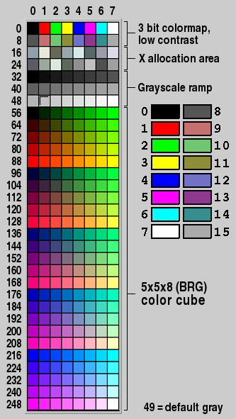
- from_hex(). This takes a 24-bit hex value in the form RGB:
#![allow(unused)]
fn main() {
const RED: Color = Color::from_hex(0xff0000); // notice it's a const functions
}
- from_rgb(). This takes 3 values r, g, b:
#![allow(unused)]
fn main() {
const RED: Color = Color::from_rgb(255, 0, 0); // notice it's a const functions
}
The Color enum also offers some convenience methods to generate different shades of the chosen color, using .darker(), .lighter(), .inactive() methods and others:
#![allow(unused)]
fn main() {
let col = Color::from_rgb(176, 100, 50).lighter();
}
If you prefer html hex string colors, you can use the from_hex_str() method:
#![allow(unused)]
fn main() {
let col = Color::from_hex_str("#ff0000");
}
FrameTypes
FLTK has a wide range of frame types. These can be found under the enums module:

These can be set using WidgetExt::set_frame(). Some widgets/traits also support set_down_frame():
use fltk::{app, enums::FrameType, frame::Frame, image::SvgImage, prelude::*, window::Window};

fn main() {
    let app = app::App::default().with_scheme(app::Scheme::Gleam);
    let mut wind = Window::new(100, 100, 400, 300, "Hello from rust");

    let mut frame = Frame::default().with_size(360, 260).center_of(&wind);
    frame.set_frame(FrameType::EngravedBox);
    let mut image = SvgImage::load("screenshots/RustLogo.svg").unwrap();
    image.scale(200, 200, true, true);
    frame.set_image(Some(image));

    wind.make_resizable(true);
    wind.end();
    wind.show();

    app.run().unwrap();
}
 Here we set the frame's FrameType to EngravedBox, which you can see around the image.
ButtonExt supports set_down_frame():
#![allow(unused)]
fn main() {
btn1.set_frame(enums::FrameType::RFlatBox);
btn1.set_down_frame(enums::FrameType::RFlatBox);
}
Furthermore, we can change the draw routine for our FrameTypes using app::set_frame_type_cb():
use fltk::{
    enums::{Color, FrameType},
    prelude::*,
    *
};

fn down_box(x: i32, y: i32, w: i32, h: i32, c: Color) {
    draw::draw_box(FrameType::RFlatBox, x, y, w, h, Color::BackGround2);
    draw::draw_box(FrameType::RoundedFrame, x - 10, y, w + 20, h, c);
}

fn main() {
    let app = app::App::default();
    app::set_frame_type_cb(FrameType::DownBox, down_box, 0, 0, 0, 0);
    let mut w = window::Window::default().with_size(480, 230).with_label("Gui");
    w.set_color(Color::from_u32(0xf5f5f5));

    let mut txf = input::Input::default().with_size(160, 30).center_of_parent();
    txf.set_color(Color::Cyan.darker());

    w.show();

    app.run().unwrap();
}

This changes the default DownBox with a custom down_box routine. We can also ImageExt::draw() inside our draw routines to draw images (Like svg images to get scalable rounded borders).
Fonts
FLTK has already 16 fonts which can be found in enums::Font:
- Helvetica
- HelveticaBold
- HelveticaItalic
- HelveticaBoldItalic
- Courier
- CourierBold
- CourierItalic
- CourierBoldItalic
- Times
- TimesBold
- TimesItalic
- TimesBoldItalic
- Symbol
- Screen
- ScreenBold
- Zapfdingbats
It also allows loading system and bundled fonts.
System fonts depend on the system, and are not loaded by default. These can be loaded using the App::load_system_fonts() method. The fonts can then be acquired using the app::fonts() function or be queried using the app::font_count(), app::font_name() and app::font_index() functions. And then can be used using the Font::by_index() or Font::by_name() methods.
use fltk::{prelude::*, *};

fn main() {
    let app = app::App::default().load_system_fonts();
    // To load a font by path, check the App::load_font() method
    let fonts = app::fonts();
    // println!("{:?}", fonts);
    let mut wind = window::Window::default().with_size(400, 300);
    let mut frame = frame::Frame::default().size_of(&wind);
    frame.set_label_size(30);
    wind.set_color(enums::Color::White);
    wind.end();
    wind.show();
    println!("The system has {} fonts!\nStarting slideshow!", fonts.len());
    let mut i = 0;
    while app.wait() {
        if i == fonts.len() {
            i = 0;
        }
        frame.set_label(&format!("[{}]", fonts[i]));
        frame.set_label_font(enums::Font::by_index(i));
        app::sleep(0.5);
        i += 1;
    }
}
If you would like to load a bundled font without it being in the system, you can alternatively use Font::load_font() and Font::set_font(), this allows you to replace one of FLTK's predefined fonts with a custom font:
use fltk::{app, enums::Font, button::Button, frame::Frame, prelude::*, window::Window};

fn main() {
    let app = app::App::default();

    let font = Font::load_font("angelina.ttf").unwrap();
    Font::set_font(Font::Helvetica, &font);
    app::set_font_size(24);

    let mut wind = Window::default().with_size(400, 300);
    let mut frame = Frame::default().with_size(200, 100).center_of(&wind);
    let mut but = Button::new(160, 210, 80, 40, "Click me!");
    wind.end();
    wind.show();

    but.set_callback(move |_| frame.set_label("Hello world"));

    app.run().unwrap();
}
load_font() loads the font from the .ttf file, set_font() replaces Font::Helvetica (FLTK's default font) with our loaded font.

Drawing things
fltk-rs provides free functions in the draw module which allow you to draw custom elements. The drawing works only if the calls are done in a context which allows drawing, such as in the WidgetBase::draw() method or in an Offscreen context:
Drawing in widgets
Notice we use the draw calls inside our widget's draw method:
use fltk::{enums, prelude::*, *};

fn main() {
    let a = app::App::default();
    let mut win = window::Window::default().with_size(400, 300);
    win.end();
    win.show();

    win.draw(|w| {
        use draw::*;
        // fill the window white
        draw_rect_fill(0, 0, w.w(), w.h(), enums::Color::White);
        // draw a blue pie
        set_draw_color(enums::Color::Blue.inactive());
        draw_pie(w.w() / 2 - 50, w.h() / 2 - 50, 100, 100, 0.0, 360.0);
        // draw angled red text
        set_draw_color(enums::Color::Red);
        set_font(enums::Font::Courier, 16);
        draw_text_angled(45, "Hello World", w.w() / 2, w.h() / 2);
    });

    a.run().unwrap();
}

We've used the whole window as our canvas, but it can be any widget as well. Other available functions allow drawing lines, rects, arcs, pies, loops, polygons, even images.
Offscreen drawing
Sometimes you would like to draw things in response to events, such as when the patients pushes and drags the cursor. In this case, you can use a draw::Offscreen to do that. In that case, we use the widget's draw method to just copy the Offscreen contents, while we do our drawing in the widget's handle method:
use fltk::{
    app,
    draw::{
        draw_line, draw_point, draw_rect_fill, set_draw_color, set_line_style, LineStyle, Offscreen,
    },
    enums::{Color, Event, FrameType},
    frame::Frame,
    prelude::*,
    window::Window,
};
use std::cell::RefCell;
use std::rc::Rc;

const WIDTH: i32 = 800;
const HEIGHT: i32 = 600;

fn main() {
    let app = app::App::default().with_scheme(app::Scheme::Gtk);

    let mut wind = Window::default()
        .with_size(WIDTH, HEIGHT)
        .with_label("RustyPainter");
    let mut frame = Frame::default()
        .with_size(WIDTH - 10, HEIGHT - 10)
        .center_of(&wind);
    frame.set_color(Color::White);
    frame.set_frame(FrameType::DownBox);

    wind.end();
    wind.show();

    // We fill our offscreen with white
    let offs = Offscreen::new(frame.width(), frame.height()).unwrap();
    #[cfg(not(target_os = "macos"))]
    {
        offs.begin();
        draw_rect_fill(0, 0, WIDTH - 10, HEIGHT - 10, Color::White);
        offs.end();
    }

    let offs = Rc::from(RefCell::from(offs));

    frame.draw({
        let offs = offs.clone();
        move |_| {
            let mut offs = offs.borrow_mut();
            if offs.is_valid() {
                offs.rescale();
                offs.copy(5, 5, WIDTH - 10, HEIGHT - 10, 0, 0);
            } else {
                offs.begin();
                draw_rect_fill(0, 0, WIDTH - 10, HEIGHT - 10, Color::White);
                offs.copy(5, 5, WIDTH - 10, HEIGHT - 10, 0, 0);
                offs.end();
            }
        }
    });

    frame.handle({
        let mut x = 0;
        let mut y = 0;
        move |f, ev| {
            // println!("{}", ev);
            // println!("coords {:?}", app::event_coords());
            // println!("get mouse {:?}", app::get_mouse());
            let offs = offs.borrow_mut();
            match ev {
                Event::Push => {
                    offs.begin();
                    set_draw_color(Color::Red);
                    set_line_style(LineStyle::Solid, 3);
                    let coords = app::event_coords();
                    x = coords.0;
                    y = coords.1;
                    draw_point(x, y);
                    offs.end();
                    f.redraw();
                    set_line_style(LineStyle::Solid, 0);
                    true
                }
                Event::Drag => {
                    offs.begin();
                    set_draw_color(Color::Red);
                    set_line_style(LineStyle::Solid, 3);
                    let coords = app::event_coords();
                    draw_line(x, y, coords.0, coords.1);
                    x = coords.0;
                    y = coords.1;
                    offs.end();
                    f.redraw();
                    set_line_style(LineStyle::Solid, 0);
                    true
                }
                _ => false,
            }
        }
    });

    app.run().unwrap();
}
Notice how we open an Offscreen context using offs.begin() then close it with offs.end(). This allows us to call drawing functions inside the Offscreen.

Styling
FLTK has a lot to offer in terms of styling applications. We have already seen that we can use true color and different fonts, in addition to draw custom things. Styling is making use of all that. It can be done per widget leveraging the methods in WidgetExt, or globally using functions in the app module.
WidgetExt
Most of the WidgetExt trait is related to modifying the frame type, label type, widget color, text color, text font and text size. These all have setters and getters which can be found here.
An example of this:
use fltk::{
    enums::{Align, Color, Font, FrameType},
    prelude::*,
    *,
};

const BLUE: Color = Color::from_hex(0x42A5F5);
const SEL_BLUE: Color = Color::from_hex(0x2196F3);
const GRAY: Color = Color::from_hex(0x757575);
const WIDTH: i32 = 600;
const HEIGHT: i32 = 400;

fn main() {
    let app = app::App::default();
    let mut win = window::Window::default()
        .with_size(WIDTH, HEIGHT)
        .with_label("Flutter-like!");
    let mut bar =
        frame::Frame::new(0, 0, WIDTH, 60, "  FLTK App!").with_align(Align::Left | Align::Inside);
    let mut text = frame::Frame::default()
        .with_size(100, 40)
        .center_of(&win)
        .with_label("You have pushed the button this many times:");
    let mut count = frame::Frame::default()
        .size_of(&text)
        .below_of(&text, 0)
        .with_label("0");
    let mut but = button::Button::new(WIDTH - 100, HEIGHT - 100, 60, 60, "@+6plus");
    win.end();
    win.make_resizable(true);
    win.show();

    // Theming
    app::background(255, 255, 255);
    app::set_visible_focus(false);

    bar.set_frame(FrameType::FlatBox);
    bar.set_label_size(22);
    bar.set_label_color(Color::White);
    bar.set_color(BLUE);
    bar.draw(|b| {
        draw::set_draw_rgb_color(211, 211, 211);
        draw::draw_rectf(0, b.height(), b.width(), 3);
    });

    text.set_label_size(18);
    text.set_label_font(Font::Times);

    count.set_label_size(36);
    count.set_label_color(GRAY);

    but.set_color(BLUE);
    but.set_selection_color(SEL_BLUE);
    but.set_label_color(Color::White);
    but.set_frame(FrameType::OFlatFrame);
    // End theming

    but.set_callback(move |_| {
        let label = (count.label().parse::<i32>().unwrap() + 1).to_string();
        count.set_label(&label);
    });

    app.run().unwrap();
}

Widgets also support showing images within them, which is discussed more in the Images section.
Global styling
These can be found in the app module. Starting from changing the app's scheme:
#![allow(unused)]
fn main() {
use fltk::{prelude::*, enums::*, *};
let app = app::App::default().with_scheme(app::Scheme::Plastic);
}
There are four schemes:
- Base
- Gtk
- Gleam
- Plastic
- Oxy
To setting the app's colors, default font, default frame type and whether to show focus on widgets.
use fltk::{app, button::Button, enums, frame::Frame, prelude::*, window::Window};

fn main() {
    let app = app::App::default();
    app::set_background_color(170, 189, 206);
    app::set_background2_color(255, 255, 255);
    app::set_foreground_color(0, 0, 0);
    app::set_selection_color(255, 160,  63);
    app::set_inactive_color(130, 149, 166);
    app::set_font(enums::Font::Times);

    let mut wind = Window::default().with_size(400, 300);
    let mut frame = Frame::default().with_size(200, 100).center_of(&wind);
    let mut but = Button::new(160, 210, 80, 40, "Click me!");
    wind.end();
    wind.show();

    but.set_callback(move |_| frame.set_label("Hello world"));

    app.run().unwrap();
}

Custom Drawing
FLTK also offers drawing primitives which makes giving a widget a custom appearance quite easy. This is done using the draw() method which takes a closure. Lets draw our own button, even though FLTK offers a ShadowFrame FrameType, let's create our own:
use fltk::{prelude::*, enums::*, *};

fn main() {
    let app = app::App::default();
    app::set_color(255, 255, 255); // white
    let mut my_window = window::Window::new(100, 100, 400, 300, "My Window");

    let mut but = button::Button::default()
        .with_pos(160, 210)
        .with_size(80, 40)
        .with_label("Button1");

    but.draw2(|b| {
        draw::set_draw_color(Color::Gray0);
        draw::draw_rectf(b.x() + 2, b.y() + 2, b.width(), b.height());
        draw::set_draw_color(Color::from_u32(0xF5F5DC));
        draw::draw_rectf(b.x(), b.y(), b.width(), b.height());
        draw::set_draw_color(Color::Black);
        draw::draw_text2(
            &b.label(),
            b.x(),
            b.y(),
            b.width(),
            b.height(),
            Align::Center,
        );
    });

    my_window.end();
    my_window.show();

    app.run().unwrap();
}

The draw() method also supports drawing images inside of widgets as will be seen in the next section.
fltk-theme
This is a crate which provides several predefined themes which can be used by just loading the theme:
use fltk::{prelude::*, *};
use fltk_theme::{widget_themes, WidgetTheme, ThemeType};

fn main() {
    let a = app::App::default();
    let widget_theme = WidgetTheme::new(ThemeType::Aero);
    widget_theme.apply();
    let mut win = window::Window::default().with_size(400, 300);
    let mut btn = button::Button::new(160, 200, 80, 30, "Hello");
    btn.set_frame(widget_themes::OS_DEFAULT_BUTTON_UP_BOX);
    win.end();
    win.show();
    a.run().unwrap();
}

Animations
Animations can be shown in fltk-rs using several mechanism:
- Leveraging the event loop
- Spawning threads
- Timeouts
Leveraging the event loop
fltk offers app::wait() and app::check() which allow updating the ui during a blocking operation:
use fltk::{enums::*, prelude::*, *};

fn main() {
    let a = app::App::default();
    let mut win = window::Window::default().with_size(400, 300);
    win.set_color(Color::White);
    // our button takes the whole left side of the window
    let mut sliding_btn = button::Button::new(0, 0, 100, 300, None);
    style_btn(&mut sliding_btn);
    win.end();
    win.show();

    sliding_btn.set_callback(|btn| {
        if btn.w() > 0 && btn.w() < 100 {
            return; // we're still animating
        }
        while btn.w() != 0 {
            btn.set_size(btn.w() - 2, btn.h());
            app::sleep(0.016);
            btn.parent().unwrap().redraw();
            app::wait(); // or app::check();
        }
    });
    a.run().unwrap();
}

fn style_btn(btn: &mut button::Button) {
    btn.set_color(Color::from_hex(0x42A5F5));
    btn.set_selection_color(Color::from_hex(0x42A5F5));
    btn.set_frame(FrameType::FlatBox);
}
Spawning threads
This ensures we don't block the main/ui thread:
use fltk::{enums::*, prelude::*, *};

fn main() {
    let a = app::App::default();
    let mut win = window::Window::default().with_size(400, 300);
    win.set_color(Color::White);
    // our button takes the whole left side of the window
    let mut sliding_btn = button::Button::new(0, 0, 100, 300, None);
    style_btn(&mut sliding_btn);
    win.end();
    win.show();

    sliding_btn.set_callback(|btn| {
        if btn.w() > 0 && btn.w() < 100 {
            return; // we're still animating
        }
        std::thread::spawn({
            let mut btn = btn.clone();
            move || {
                while btn.w() != 0 {
                    btn.set_size(btn.w() - 2, btn.h());
                    app::sleep(0.016);
                    app::awake(); // to awaken the ui thread
                    btn.parent().unwrap().redraw();
                }
            }
        });
    });
    a.run().unwrap();
}

fn style_btn(btn: &mut button::Button) {
    btn.set_color(Color::from_hex(0x42A5F5));
    btn.set_selection_color(Color::from_hex(0x42A5F5));
    btn.set_frame(FrameType::FlatBox);
}
Timeouts
fltk offers timeouts for recurring operations. We can add a timeout, repeat it and remove it:
use fltk::{enums::*, prelude::*, *};

fn move_button(mut btn: button::Button, handle: app::TimeoutHandle) {
    btn.set_size(btn.w() - 2, btn.h());
    btn.parent().unwrap().redraw();
    if btn.w() == 20 {
        app::remove_timeout3(handle);
    } else {
        app::repeat_timeout3(0.016, handle);
    }
}

fn main() {
    let a = app::App::default();
    let mut win = window::Window::default().with_size(400, 300);
    win.set_color(Color::White);
    let mut btn = button::Button::new(0, 0, 100, 300, None);
    style_btn(&mut btn);
    btn.clear_visible_focus();
    win.end();
    win.show();

    btn.set_callback(|b| {
        let btn = b.clone();
        app::add_timeout3(0.016, move |handle| {
            let btn = btn.clone();
            move_button(btn, handle)
        });
    });

    a.run().unwrap();
}

fn style_btn(btn: &mut button::Button) {
    btn.set_color(Color::from_hex(0x42A5F5));
    btn.set_selection_color(Color::from_hex(0x42A5F5));
    btn.set_frame(FrameType::FlatBox);
}
We basically add the timeout when the user clicks the button, and depending on the size of the button we either repeat it or remove it.
Accessibility
FLTK offers several accessibility features out of the box:
Keyboard navigation among and within ui elements
This is automatically enabled by FLTK. Depending on the order of widget creation, and whether a widget receives focus, you can use the arrow keys or the tab and shift-tab keys to navigate to the next/previous widget. Similarly for menu items, you can navigate using the keyboard.
Keyboard shortcuts
Button widgets and Menu widgets provide a method which allows setting the keyboard shortcut:
#![allow(unused)]
fn main() {
use fltk::{prelude::*, *};

let mut menu = menu::MenuBar::default().with_size(800, 35);
menu.add(
    "&File/New...\t",
    Shortcut::Ctrl | 'n',
    menu::MenuFlag::Normal,
    |_m| {},
);

let mut btn = button::Button::new(100, 100, 80, 30, "Click me");
btn.set_shortcut(enums::Shortcut::Ctrl | 'b');
}
Keyboard alternatives to pointer actions
This is automatically enabled by FLTK.
Depending on whether an item has a by default CallbackTrigger::EnterKey trigger, or the trigger is set using set_trigger, it should fire the callback when the enter key is pressed.
Buttons, for example, respond to the enter key automatically if they have focus. To change the trigger for a widget:
#![allow(unused)]
fn main() {
use fltk::{prelude::*, *};

let mut inp = input::Input::new(10, 10, 160, 30, None);
inp.set_trigger(enums::CallbackTrigger::EnterKey);
inp.set_callback(|i| println!("You clicked enter, and the input's current text is: {}", i.value()));
}
IME support
The input method editor is automatically enabled for languages which require it like Chinese, Japanese and Korean. FLTK uses the OS provided IME in this case.
Keyboard screen scaling
Similar to many web browsers, FLTK has 3 default global shortcuts (Ctrl/+/-/0/ [Cmd/+/-/0/ under macOS]) that change the value of the GUI scaling factor. Ctrl+ zooms-in all app windows of the focussed display (all displays under macOS); Ctrl- zooms-out these windows; Ctrl 0 restores the initial value of the scaling factor.
The ability to customize key events for your widgets, even custom widgets
Using the WidgetExt::handle method, you can customize how widgets handle events, including key events.
#![allow(unused)]
fn main() {
use fltk::{prelude::*, *};

let mut win = window::Window::default().with_size(400, 300);
win.handle(|w, ev| {
    enums::Event::KeyUp => {
        let key = app::event_key();
        match key {
            enums::Key::End => app::quit(), // just an example
            _ => {
                if let Some(k) = key.to_char() {
                    match k {
                        'q' => app::quit(),
                        _ => (),
                    }
                }
            },
        }
        true
    },
    _ => false,
});
}
Screen reader support
Screen reader support is currently implemented as an external crate:
This uses the accesskit crate to complete the accessibility story for FLTK.
Example:
#![windows_subsystem = "windows"]
use fltk::{prelude::*, *};
use fltk_accesskit::{AccessibilityContext, AccessibleApp};

fn main() {
    let a = app::App::default().with_scheme(app::Scheme::Oxy);
    let mut w = window::Window::default()
        .with_size(400, 300)
        .with_label("Hello fltk-accesskit");
    let col = group::Flex::default()
        .with_size(200, 100)
        .center_of_parent()
        .column();
    let inp = input::Input::default().with_id("inp").with_label("Enter name:");
    let mut btn = button::Button::default().with_label("Greet");
    let out = output::Output::default().with_id("out");
    col.end();
    w.end();
    w.make_resizable(true);
    w.show();

    btn.set_callback(btn_callback);

    let ac = AccessibilityContext::new(
        w,
        vec![Box::new(inp), Box::new(btn), Box::new(out)],
    );

    a.run_with_accessibility(ac).unwrap();
}

fn btn_callback(_btn: &mut button::Button) {
    let inp: input::Input = app::widget_from_id("inp").unwrap();
    let mut out: output::Output = app::widget_from_id("out").unwrap();
    let name = inp.value();
    if name.is_empty() {
        return;
    }
    out.set_value(&format!("Hello {}", name));
}
The Accessible trait is implemented for several FLTK widgets.
The example requires instantiating an fltk_accesskit::AccessibilityContext, in which you pass the root (main window) and the widgets you want recognized by the screen-reader.
Then you would run the App struct using the special method run_with_accessibility.
A demonstration video can be found here.
FAQ
Build issues
Why does the build fails when I follow one of the tutorials?
The first tutorial uses the fltk-bundled feature flag, which is only supported for certain platforms since these are built using the Github Actions CI, namely:
- Windows 10 x64 (msvc and gnu).
- MacOS 12 x64 and aarch64.
- Ubuntu 20.04 or later, x64 and aarch64.
If you're not running one of the aforementioned platforms, you'll have to remove the fltk-bundled feature flag in your Cargo.toml file:
[dependencies]
fltk = "^1.4"
Furthermore, the fltk-bundled flag assumes you have curl and tar installed (for Windows, they're available in the Native Tools Command Prompt).
Build fails on windows, why can't CMake find my toolchain?
If you're building using the MSVC toolchain, make sure you run your build (at least your initial build) using the Native Tools Command Prompt, which should appear once you start typing "native" in the start menu, choose the version corresponding to your installed Rust toolchain (x86 or x64). The Native Tools Command Prompt has all the environment variables set correctly for native development. cmake-rs which the bindings use might not be able to find the Visual Studio 2022 generator, in which case, you can try to use the fltk-bundled feature, or use ninja via the use-ninja feature. This requires installing Ninja which can be installed with Chocolatey, Scoop or manually.
If you're building for the GNU toolchain, make sure that Make is also installed, which usually comes installed in mingw64 toolchain.
Build fails on MacOS 11 with an Apple M1 chip, what can I do?
If you're getting "file too small to be an archive" error, you might be hitting this issues or this issue. MacOS's native C/C++ toolchain shouldn't have this issue, and can be installed by running xcode-select --install or by installing XCode. Make sure the corresponding Rust toolchain (aarch64-apple-darwin) is installed as well. You can uninstall other Rust apple-darwin toolchains or use cargo-lipo instead if you need universal/fat binaries.
Why do I get a Link error while using the mingw toolchain on windows?
If the linking fails because of this issue with older toolchains, it should work by using the fltk-shared feature (an issue with older compilers). Which would also generate a dynamic library which would need to be deployed with your application.
[dependencies]
fltk = { version = "^1.4", features = ["fltk-shared"] }
Why does my msys2 mingw built fltk app using, fltk-bundled, isn't self-contained and requires several dlls?
If you have installed libgdiplus via pacman, it would require those dependencies on other systems. If you're using the windows sdk-provided libgdiplus, it shouldn't require extra dlls. You can either uninstall libgdiplus that was installed via pacman, or or you can build using the feature flag: no-gdiplus.
Why do I get link errors when I use the system-fltk feature?
This crate targets FLTK 1.4, while currently most distros distribute an older version of FLTK (1.3.5). You can try to install FLTK (C++) by building from source.
Build fails on Arch linux because of pango or cairo?
Pango changed its include paths which caused build failures across many projects. There are 2 solutions:
- Use the no-pango feature. Downsides: loss of rtl and cjk language support.
- Set the CFLAGS and CXXFLAGS to correct the global include paths.
export CFLAGS="-isystem /usr/include/harfbuzz -isystem /usr/include/cairo"
export CXXFLAGS="-isystem /usr/include/harfbuzz -isystem /usr/include/cairo"
How do I force CMake to use a certain C++ compiler?
FLTK works with all 3 major compilers. If you would like to change the C++ compiler that's chosen by default by CMake, you can change the CXX environment variable before running the build:
export CXX=/usr/bin/clang++
cargo run
CMake caches the C++ compiler variable after it's first run, so if the above failed because of a previous run, you would have to run cargo clean or you can manually delete the CMakeCache.txt file in the build directory.
Can I accelerate the build speed?
You can use the "use-ninja" feature flag if you have ninja installed.
Can I cache a previous build of the FLTK library?
You can use the fltk-bundled feature and use either the CFLTK_BUNDLE_DIR or CFLTK_BUNDLE_URL to point to the location of your cached cfltk and fltk libraries.
Deployment
How do I deploy my application?
Rust, by default, statically links your application. FLTK is built also for static linking. That means that the resulting executable can be directly deployed without the need to deploy other files along with it. If you want to create a WIN32 application, Mac OS Bundle or Linux AppImage, please check the question just below!
Why do I get a console window whenever I start my GUI app?
This is the default behavior of the toolchain, and is helpful for debugging purposes. It can be turned off easily by adding #![windows_subsystem = "windows"] at the beginning of your main.rs file if you're on windows.
If you would like to keep the console window on debug builds, but not on release builds, you can use #![cfg_attr(not(debug_assertions), windows_subsystem = "windows")] instead.
For Mac OS and Linux, this is done by a post-build process to create a Mac OS Bundle or Linux AppImage respectively.
See cargo-bundle for an automated tool for creating Mac OS app bundles.
See here for directions on creating an AppImage for Linux.
Why is the size of my resulting executable larger than I had expected?
FLTK is known for it's small applications. Make sure you're building in release, and make sure symbols are stripped using the strip command in Unix-like systems. On Windows it's unnecessary since symbols would end up in the pdb file (which shouldn't be deployed).
If you need an even smaller size, try using opt-level="z":
[profile.release]
opt-level = "z"
lto = true
codegen-units = 1
panic = "abort"
Newer versions of cargo (>1.55) support automatically stripping binaries in the post-build phase:
cargo-features = ["strip"]

[profile.release]
strip = true
opt-level = "z"
lto = true
codegen-units = 1
panic = "abort"
Furthermore, you can build Rust's stdlib optimized for size (it comes optimized for speed by default). More info on that here
Can I cross-compile my application to a mobile platform or WASM?
FLTK currently doesn't support WASM nor iOS. It has experimental support for Android (YMMV). It is focused on desktop applications.
Licensing
Can I use this crate in a commercial application?
Yes. This crate has an MIT license which requires acknowledgment. FLTK (the C++ library) is licensed under the LGPL license with an exception allowing static linking for commercial/closed-source use. You can find the full terms of both licenses here:
Alignment
Why can't I align input or output text to the right?
FLTK has some known issues with text alignment.
Concurrency
Do you plan on supporting multithreading or async/await?
FLTK supports multithreaded and concurrent applications. See the examples dir and the fltk-rs demos repo for examples on usage with threads, messages, async_std and tokio (web-todo examples).
Should I explicitly call app::lock() and app::unlock()?
fltk-rs surrounds all mutating calls to widgets with a lock on the C++ wrapper side. Normally you wouldn't have to call app::lock() and app::unlock().
This depends however on the support of recursive mutexes in your system.
If you notice haning in multithreaded applications, you might have to initialize threads (like xlib threads) by calling app::lock() once in your main thread.
In that case, you can wrap widgets in an Arc
Windowing
Why does FLTK exit when I hit the escape key?
This is the default behavior in FLTK. You can easily override it by setting a callback for your main window:
#![allow(unused)]
fn main() {
    wind.set_callback(|_| {
        if fltk::app::event() == fltk::enums::Event::Close {
            app::quit(); // Which would close using the close button. You can also assign other keys to close the application
        }
    });
}
Panics/Crashes
My app panics when I try to handle events, how can I fix it?
This is due to a debug_assert which checks that the involved widget and the window are capable of handling events. Although most events would be handled correctly, some events require that the aforementioned conditions be met. Thus it is advisable to place your event handling code after the main drawing is done, i.e after calling your main window's show() method. Another point is that event handling and drawing should be done in the main thread. Panics accross FFI boundaries are undefined behavior, as such, the wrapper never throws. Furthermore, all panics which might arise in callbacks are caught on the Rust side using catch_unwind.
Memory and unsafety
How memory-safe is fltk-rs?
The callback mechanism consists of a closure as a void pointer with a shim which dereferences the void pointer into a function pointer and calls the function. This is technically undefined behavior, however most implementations permit it and it's the method used by most wrappers to handle callbacks across FFI boundaries. link
As stated before, panics accross FFI boundaries are undefined behavior, as such, the C++ wrapper never throws. Furthermore, all panics which might arise in callbacks are caught on the Rust side using catch_unwind.
FLTK manages it's own memory. Any widget is automatically owned by a parent which does the book-keeping as well and deletion, this is the enclosing widget implementing GroupExt such as windws etc. This is done in the C++ FLTK library itself. Any constructed widget calls the current() method which detects the enclosing group widget, and calls its add() method rending ownership to the group widget. Upon destruction of the group widget, all owned widgets are freed. Also all widgets are wrapped in a mutex for all mutating methods, and their lifetimes are tracked using an Fl_Widget_Tracker, That means widgets have interior mutability as if wrapped in an Arc<Mutex
Overriding drawing methods will box data to be sent to the C++ library, so the data should optimally be limited to widgets or plain old data types to avoid unnecessary leaks if a custom drawn widget might be deleted during the lifetime of the program.
Can I get memory leaks with fltk-rs?
Non-parented widgets that can no longer be accessed are a memory leak. Otherwise, as mentioned in the previous section all parented widgets lifetimes' are managed by the parent. An example of a leaking widget:
fn main() {
    let a = app::App::default();
    let mut win = window::Window::default();
    win.end();
    win.show();

    {
        button::Button::default(); // this leaks since it's not parented by the window, and has no handle in main
    }
}
A more subtle cause of leaks, is removing a widget from a group, then the scope ends without it being added to another group or deleted:
fn main() {
    let a = app::App::default();
    let mut win = window::Window::default();
    {
        button::Button::default(); // This doesn't leak since the parent is the window
    }
    win.end();
    win.show();

    {
        win.remove_by_index(0); // the button leaks here since it's removed and we no longer have access to it
    }
}
Why is fltk-rs using so much unsafe code?
Interfacing with C++ or C code can't be reasoned about by the Rust compiler, so the unsafe keyword is needed.
Is fltk-rs panic/exception-safe?
FLTK (C++) doesn't throw exceptions, neither do the C wrapper (cfltk) nor the fltk-sys crate. The higher level fltk crate, which wraps fltk-sys, is not exception-safe since it uses asserts internally after various operations to ensure memory-safety. An example is a widget constructor which checks that the returned pointer (from the C++ side) is not null from allocation failure. It also asserts all widget reads/writes are happening on valid (not deleted) widgets. Also any function sending a string across FFI is checked for interal null bytes. For such functions, the developer can perform a sanity check on passed strings to make sure they're valid UTF-8 strings, or check that a widget was not deleted prior to accessing a widget. That said, all functions passed as callbacks to be handled by the C++ side are exception-safe.
Are there any environment variables which can affect the build or behavior?
CFLTK_TOOLCHAIN=<path>allows passing the path to a CMake file acting as a CMAKE_TOOLCHAIN_FILE, this allows passing extra info to cmake if needed.CFLTK_WAYLAND_ONLY=<1 or 0>allows building for wayland only without directly linking X11 libs nor relying on their headers for the build process. This only works with theuse-waylandfeature flag.CFLTK_BUNDLE_DIR=<path>allows passing a path of prebuilt cfltk and fltk static libs, useful for when a customized build of fltk is needed, or for targetting other arches when building with thefltk-bundledflag.CFLTK_BUNDLE_URL=<url>similar to above but allows passing a url which will directs the build script to download from the passed url.FLTK_BACKEND=<x11 or wayland>allows choosing the backend of your hybrid X11/wayland FLTK app. This only works for apps built withuse-waylandfeature flag.
Contributing
Please refer to the CONTRIBUTING page for further information.